Share Facebook Twitter LinkedIn Pinterest Bluesky Threads [OC] Demographic transition at a logarithmic scale Posted by thedylanackerman
thedylanackerman on January 27, 2025 9:55 pm Data : World Bank data from 1960 to 2023 including crude birth and death rates as well as population (bubble size) Tools : R, specifically ggplot and gganimate
Groftsan on January 27, 2025 10:18 pm I want to know about that Middle Eastern/North African blob that gets <1% Death rate circa 2009. What’s going on there, and where is that?
eric5014 on January 27, 2025 10:30 pm I don’t think the log scale works well for this. Countries reaching the low numbers are flying around quickly. Then again, if I saw it in linear I might think “This would work better in a log scale”. In such cases I think log(x + c) can be a good compromise.
dml997 on January 27, 2025 11:47 pm Very interesting but moves kindof fast, and then repeats without a break. What are the rates expressed in? It seems to say % but that can’t be since nowhere has a 10% death rate or 50% birth rate per year.
BlueScarfWolf on January 28, 2025 12:11 am Keep watching until 2019/2020, and then see every bubble take a jump to the right. Wonder what happened there? :3
SoftwareHatesU on January 28, 2025 6:59 am India just slowly crawling down and crossing median is satisfying
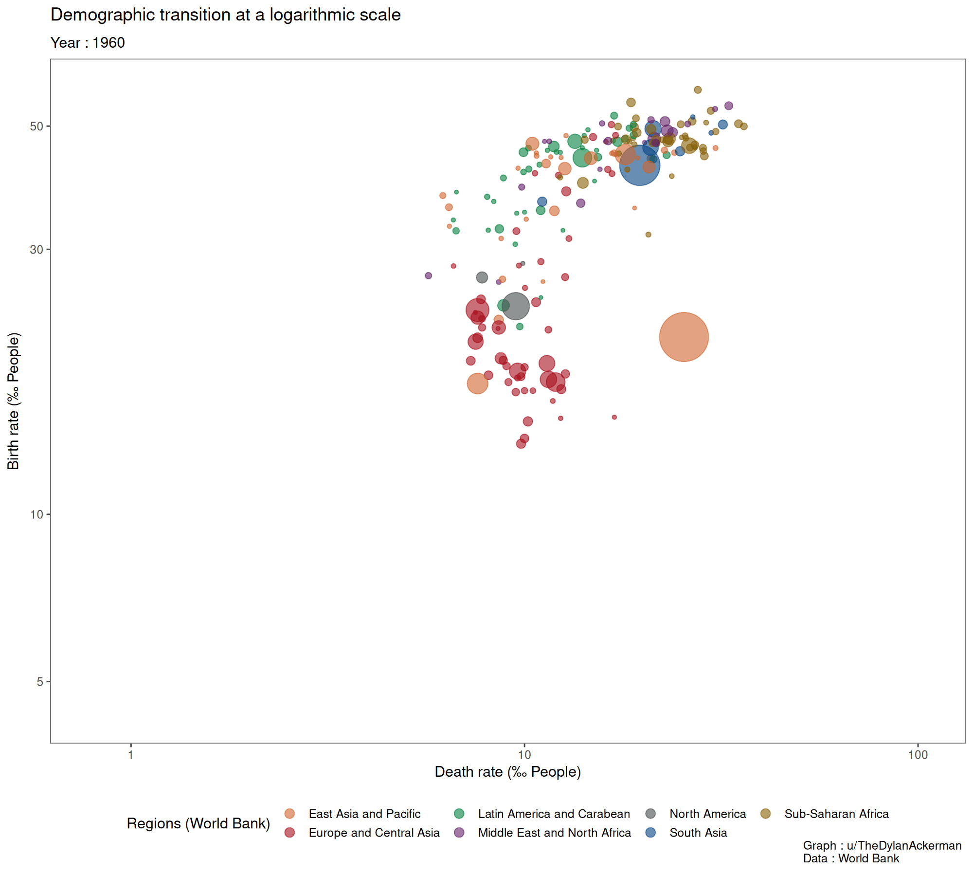

![[OC] Demographic transition at a logarithmic scale](https://www.byteseu.com/wp-content/uploads/2025/01/v2ay5st7ylfe1-1536x1382.gif "[OC] Demographic transition at a logarithmic scale")
9 Comments
Data : World Bank data from 1960 to 2023 including crude birth and death rates as well as population (bubble size)
Tools : R, specifically ggplot and gganimate
Yep, this data is beautiful
I want to know about that Middle Eastern/North African blob that gets <1% Death rate circa 2009. What’s going on there, and where is that?
A fascinating data visualization. Thanks!
I don’t think the log scale works well for this. Countries reaching the low numbers are flying around quickly.
Then again, if I saw it in linear I might think “This would work better in a log scale”.
In such cases I think log(x + c) can be a good compromise.
Very interesting but moves kindof fast, and then repeats without a break.
What are the rates expressed in? It seems to say % but that can’t be since nowhere has a 10% death rate or 50% birth rate per year.
Keep watching until 2019/2020, and then see every bubble take a jump to the right. Wonder what happened there? :3
I’m getting a “This video cannot be played.” error.
India just slowly crawling down and crossing median is satisfying