Since this is a contentions subject I want to make clear that this I post this without taking a stance on anything this might concern.
bobbybouchier on
Pretty much lines up with the respective percentage of the population of each group.
DeliberateDendrite on
This would be easier to understand as multiple scatter plots of births vs religion, panelled by decade.
ale_93113 on
What would be interested would be if it was the combined graph of both Israel AND palestine
Resident_Skroob on
What is this showing, other than the fact that % of births lines up pretty clearly with the percentage of population? If anything, it’s obscuring birthrate by religion.
And because you don’t plot as % of the total population by religion, this doesn’t actually show *anything.*
There is nothing “controversial” about this, and it’s actually obfuscating data.
LilPorker on
Can we get number of births relative to size of each religion
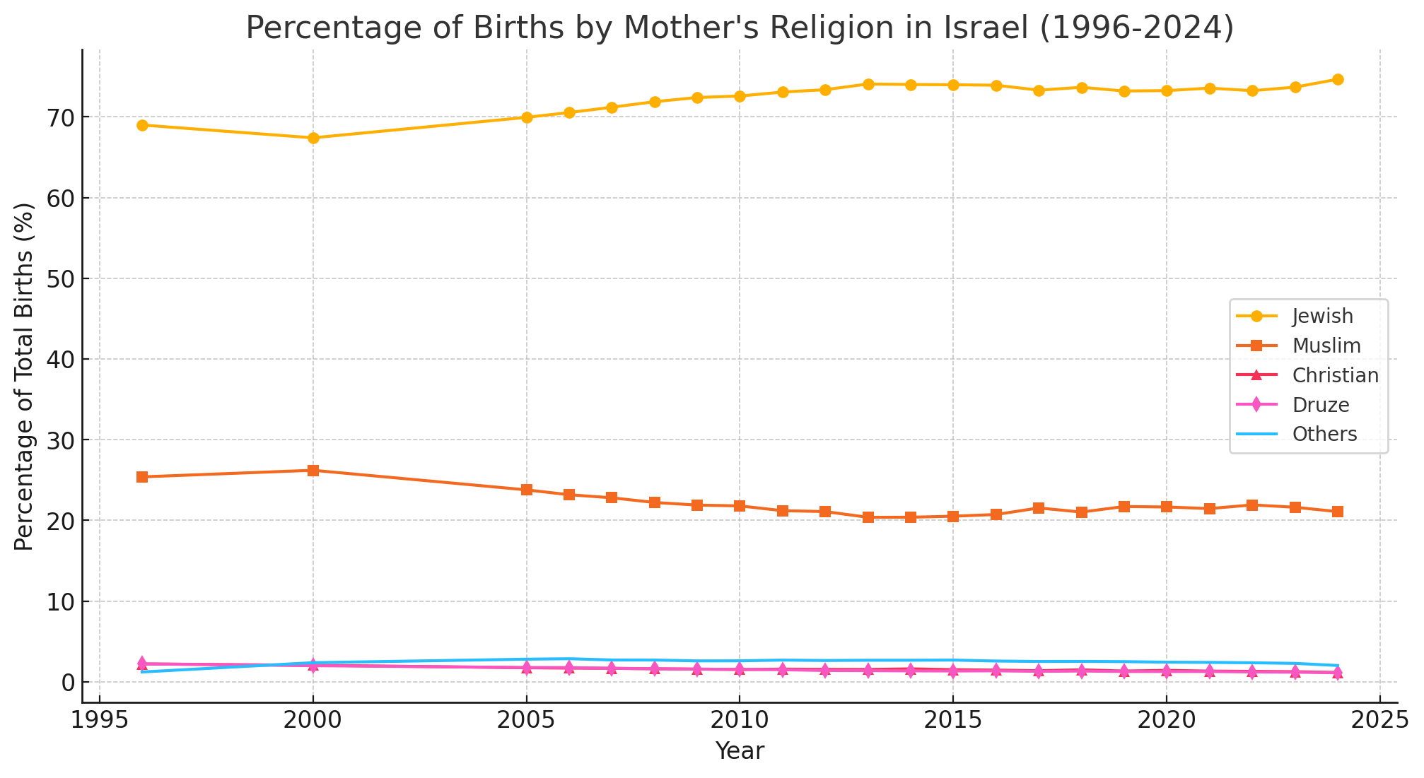

![[OC] Percentage of Births by Mother's Religion in Israel (1996-2024)](https://www.byteseu.com/wp-content/uploads/2025/02/kyf5eley94ie1-1536x840.png "[OC] Percentage of Births by Mother’s Religion in Israel (1996-2024)")
6 Comments
( Source ): [https://www.cbs.gov.il/he/publications/doclib/2023/yarhon0523/c1.pdf](https://www.cbs.gov.il/he/publications/doclib/2023/yarhon0523/c1.pdf)
( Tool ): ChatGPT
Since this is a contentions subject I want to make clear that this I post this without taking a stance on anything this might concern.
Pretty much lines up with the respective percentage of the population of each group.
This would be easier to understand as multiple scatter plots of births vs religion, panelled by decade.
What would be interested would be if it was the combined graph of both Israel AND palestine
What is this showing, other than the fact that % of births lines up pretty clearly with the percentage of population? If anything, it’s obscuring birthrate by religion.
And because you don’t plot as % of the total population by religion, this doesn’t actually show *anything.*
There is nothing “controversial” about this, and it’s actually obfuscating data.
Can we get number of births relative to size of each religion