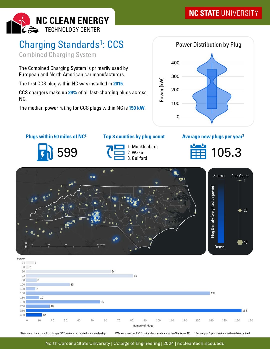
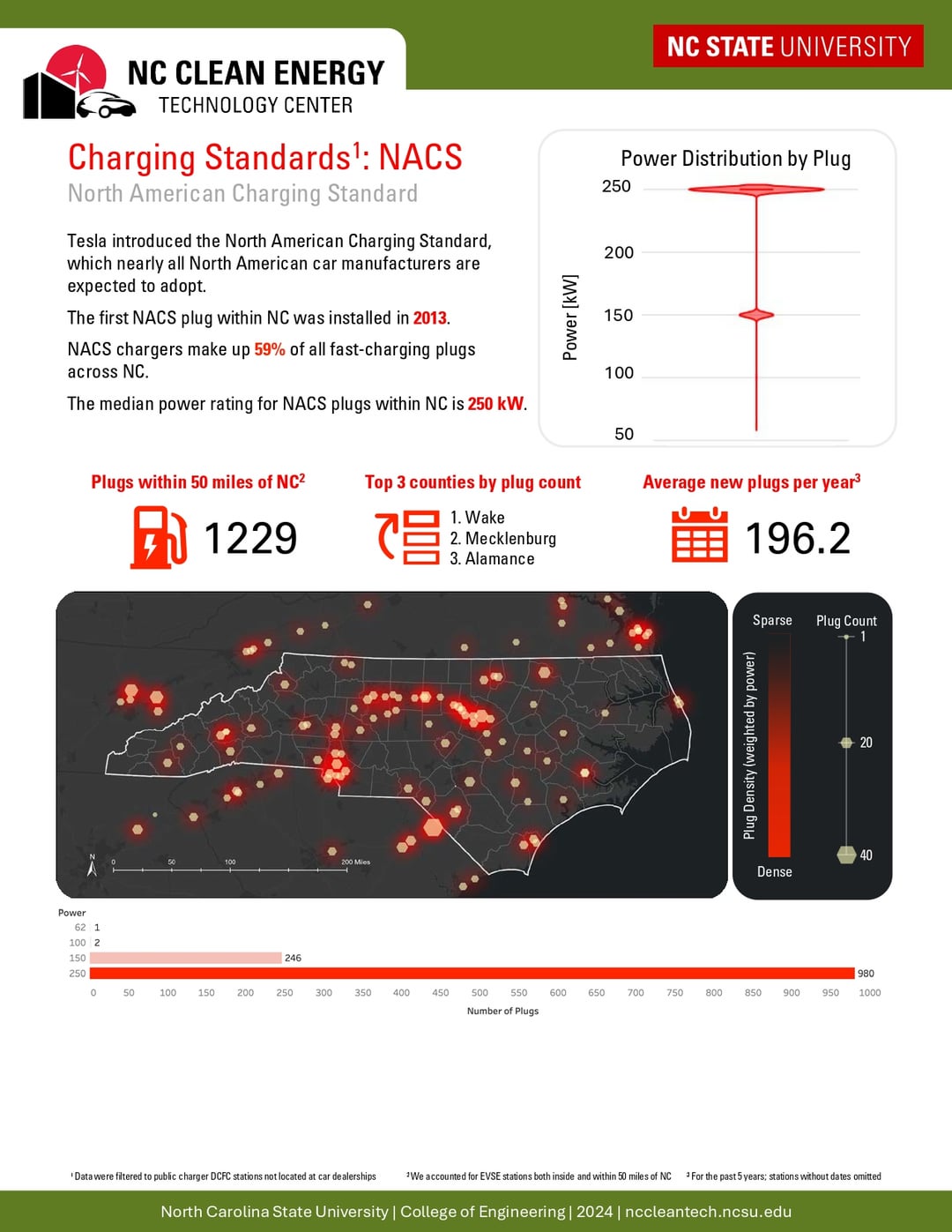
Violin plots are garbage. A violin plot with an overlayed with a box plot is an explicit acknowledgement of that. Just use a histogram, or just use the box and wiskers.
felneradi on
Great charts! I learned something just by looking at them. If I were to be picky, I’d suggest removing the power data below since it’s redundant to the violin plot above. This would help streamline the message. Well done!
Dyslexic_Wizard on
I’d scale all plots to have the same axes maximum value.


![[OC] EV Charger Distribution in North Carolina Infographic](https://www.byteseu.com/wp-content/uploads/2025/02/idd9us33qeie1-792x1024.jpg "[OC] EV Charger Distribution in North Carolina Infographic")
4 Comments
The visuals were created using ArcGIS, Plotly, and Tableau.
Data fetched from [https://plugshare.com/](https://plugshare.com/)
You can find the blog about this post at [NC Clean Energy Technology Blog](https://nccleantech.ncsu.edu/2024/11/20/interactive-map-and-infographics-support-ev-charging-accessibility-and-preparation-in-north-carolina-2/)
Violin plots are garbage. A violin plot with an overlayed with a box plot is an explicit acknowledgement of that. Just use a histogram, or just use the box and wiskers.
Great charts! I learned something just by looking at them. If I were to be picky, I’d suggest removing the power data below since it’s redundant to the violin plot above. This would help streamline the message. Well done!
I’d scale all plots to have the same axes maximum value.