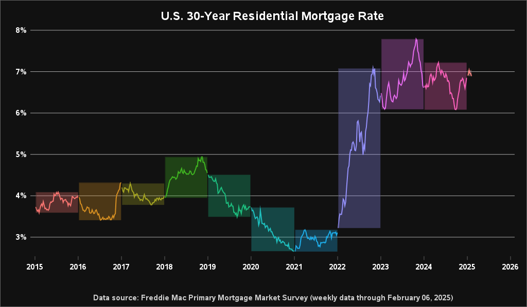
Pretty colors but I don’t like suppressed zero graphs.
disappointed_darwin on
The aberration is the pre-2022 rate climate, not the current.
hundredbagger on
Best trade I ever made was doing a re-fi on 12/24/2020.
rollduptrips on
It’s pretty I guess but I don’t like the y axis and I have no idea what the colors are trying to tell me. What makes a section of time a section of time?
Glass48 on
Not including a longer time span makes look like serve never had rates like this. Make the time line longer- like since the beginning of 30 yr mtgs
Soccer_Vader on
God how I would hope for us to have 2018 rates. Our home buying power is down by 4-500k, because of the interest rates crazy.
I_hate_all_of_ewe on
This chart really deserves to be extended back another 10-20 years.
RockChalk9799 on
Yeah….cherry picking the start date. I paid over 7% in the early 2000s on my first house. Heck, my parents had a 14% back in the 70s. Include those dates.
maxdacat on
Aussie here – is anyone really locking in a 30 year mortgage at 6-8% now in the US?
Andreas1120 on
Please show the 0% bottom and exten to 1945. Will add a lot of perspective.
This graph is almost deceptive.
barely_a_manager on
I think the yearly highlight is irrelevant and doesn’t add any value
LWMeek on
This is a good visual. I like the look of the piece.
CletusDSpuckler on
The average mortgage rate, taken every month for the last 60+ years, is about 7 3/4 percent.
Slowknots on
I paid 6% on my 1st mortgage.
The-10ft-line on
Yeah we are never leaving our “starter home”
Icy_Animal8256 on
What kind of graph allows the data to go below the axis?
ew2x4 on
Post-2008 interest rates are an anomaly and we’ll likely never see a stretch like that again.
k-anapy on
Where’s that little gen z pos who assured meet there was no possible way I needed to make 180k to buy a house on the west coast
badboybilly42582 on
Was part of the summer of 2021 2.5% re-fi club. Financially makes no sense to move with such a low rate. Guess i’m stuck at my current property for a while.

20 Comments
Data source: https://www.freddiemac.com/pmms
Software used: SAS
This graph is an imitation of Len Kiefer’s graphs, but using SAS software.
Here’s an example of one of Len’s graphs: https://x.com/lenkiefer/status/1194995742278074369
Pretty colors but I don’t like suppressed zero graphs.
The aberration is the pre-2022 rate climate, not the current.
Best trade I ever made was doing a re-fi on 12/24/2020.
It’s pretty I guess but I don’t like the y axis and I have no idea what the colors are trying to tell me. What makes a section of time a section of time?
Not including a longer time span makes look like serve never had rates like this. Make the time line longer- like since the beginning of 30 yr mtgs
God how I would hope for us to have 2018 rates. Our home buying power is down by 4-500k, because of the interest rates crazy.
This chart really deserves to be extended back another 10-20 years.
Yeah….cherry picking the start date. I paid over 7% in the early 2000s on my first house. Heck, my parents had a 14% back in the 70s. Include those dates.
Aussie here – is anyone really locking in a 30 year mortgage at 6-8% now in the US?
Please show the 0% bottom and exten to 1945. Will add a lot of perspective.
This graph is almost deceptive.
I think the yearly highlight is irrelevant and doesn’t add any value
This is a good visual. I like the look of the piece.
The average mortgage rate, taken every month for the last 60+ years, is about 7 3/4 percent.
I paid 6% on my 1st mortgage.
Yeah we are never leaving our “starter home”
What kind of graph allows the data to go below the axis?
Post-2008 interest rates are an anomaly and we’ll likely never see a stretch like that again.
Where’s that little gen z pos who assured meet there was no possible way I needed to make 180k to buy a house on the west coast
Was part of the summer of 2021 2.5% re-fi club. Financially makes no sense to move with such a low rate. Guess i’m stuck at my current property for a while.