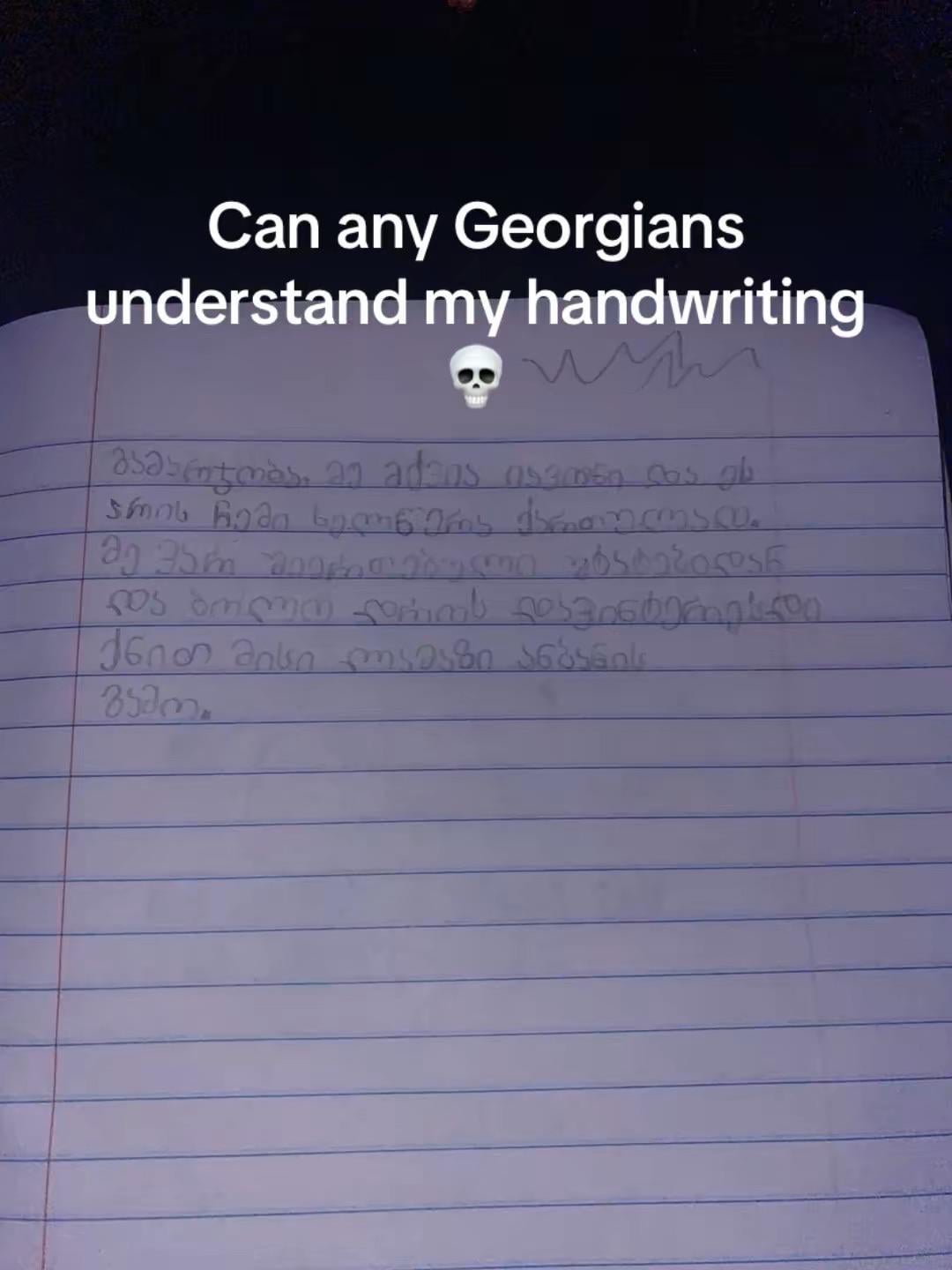
Can any Georgians understand my handwriting? I recently took interest in the language so I am still learning the alphabet.
https://i.redd.it/ni0rg3n6mpie1.jpeg
Posted by Commercial-Divide-39


Can any Georgians understand my handwriting? I recently took interest in the language so I am still learning the alphabet.
https://i.redd.it/ni0rg3n6mpie1.jpeg
Posted by Commercial-Divide-39
36 Comments
I have to be honest; this handwriting is one of the best I’ve seen so far
(Edit: needs to be alligned with lines, nothing else)
კი
Bruh, your handwriting looks better than mine
That’s super good
It looks like 3rd graders hand, and it is pretty good
ქნით ?? 😁
Edit: or do you mean ენით? I thought you made up abbreviation of ქართული ენით
its good enough to understand just have to align words with the grid thats all i read everything well except for the name NGL good job bro and good luck
it looks great! good work
Looks way better than mine and i’m a native speaker.
Pretty badass tbh
https://preview.redd.it/uuj1pmw7upie1.jpeg?width=2296&format=pjpg&auto=webp&s=fa819fe79510afbb8780265d7ce5bea3bd7dfcfb
here is mine lol, and i was born here 😂
It’s good enough!
But please use a pen next time.
No idea why can’t I enlarge the picture. But I can read it with eyes on economy mode (economy eyes – squinting the eyes).
I would just say that your handwriting is wonderful and thank you for learning my beloved language.
can we stop this idiotic trend of putting “💀” emoji at the slightest inconvenience ?
That’s really good and easy to understand but it doesn’t look like it was written by a Georgian and I’ll give you a few tips to fix that. The biggest one is that it isn’t alligned with the lines, meaning not all letters are supposed to be written above the line. Think of how y, g or q are written. Also some letters you wrote like ვ, the lower part shold be 1.5x times the size of the upper part and some letters like ტ are not written like that outside of the font. Same with ჯ, ჭ, ზ. They’re a bit different in written Georgian.
It is readable, but you should mind that some letters dip under the line, and some go above, e.g. გმ. I quickly googled this:
[https://gda.ge/shared/UserFiles/Images/4.kaligraphiis-rveuli-dedani.pdf](https://gda.ge/shared/UserFiles/Images/4.kaligraphiis-rveuli-dedani.pdf) (from page 12)
notebooks with this pattern are used in Georgian schools for first-graders
Yes! Its fully understandable and gramatically correct aswell. But as some other comment mentioned, be careful to write some letters above the line and some below! ☺️
This is a very pretty, but very unusual handwriting. I can’t remember anyone writing all caps in Georgian and I must admit that it looks awesome
7.5/10
Years ago I had a bad writing style. I came up with the style similar to yours, every letter on the same level. It is easier for me to write faster like that. Now everyone tells me that my handwriting is very nice, lol. Looks sick! Keep it up! 👍🏻
bro its better than mine 😭😭😭
That’s actually not bad, as everyone is telling you, you should align the letters with the lines, it is kinda must in Georgian, we do not have caps, so using the lines is very important, the only place Georgian font is used in caps are the advertisements, never in the text.
Also we start paragraphs not from the edge of the paper, but a little bit pushed on the right, just a bit. You are doing very good, just need a little bit practice. Very nice to see you trying, good luck 🥰
It is pretty decent handwriting, as others said just start aligning letters some above the line some below and you are set!
Bro writes like a printer (that’s a compliment btw)
Although now im curious what Georgians will think of MY handwriting
https://preview.redd.it/wafzf3dppqie1.jpeg?width=1960&format=pjpg&auto=webp&s=fb043579fdbd3f3799a2b609f0b2698558f2d78c
Ignore the bad spellings. I was writing things down mid conversation and corrected spelling later when I wasn’t actively listening
That is really sweet handwriting 🥰
Decent.
Excellent job! Keep it that way!
Much, much better than mine.
ძალიან კარგი, წარმატებები ქართულის სწავლაში თანამემამულე ქართული შემსწავლელისგან
ქნით?
thats nothing lol
Looks fine except not every letter is usually written on the same height on the lines
Not Georgian, but I know the alphabet. Neat, I could recognize most of it. The only problem I see is that the pen is rather weak or is it a pencil?
Seriously tho, It’s not bad. It’s on a level of a 2nd or 3rd grader georgian kids.
I mean yeah , the letters are distinct and they’re easily readable
Yooo this looks 🔥 🔥 🔥
Keep it up!!!💪💯