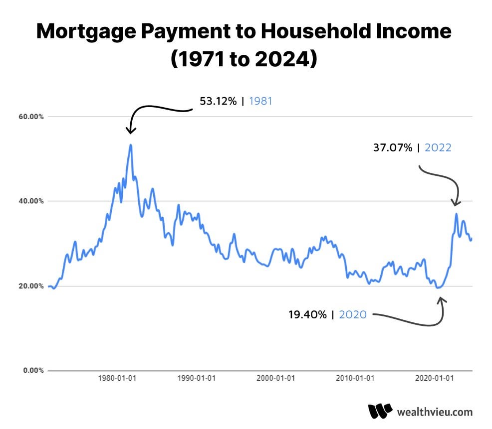
For those wondering, in Canada it’s not really been below 35% in the last 20 years.
lordnacho666 on
Nice chart. The main confounder I can think of is that the size of households might have changed over the years.
kennisdj5 on
One thing not reflected here is the regulatory changes introduced following the 2008 housing crash. Namely, the establishment of the ability to repay and qualified mortgage (ATR/QM) standards introduced by the Dodd Frank act.
ATR/QM requires mortgage lenders to assess a borrower’s ability to repay and sets some standards for how that is derived. Income is obviously paramount to that analysis. Lenders can be held liable for mortgage defaults or subject to penalties if they do not follow ATR/QM standards. There is a market for non-QM loans but it is small in comparison to the broader QM market.
In a nutshell, that means that while ATR/QM is in effect, it’s likely that percentage will never go back up in to that 50%+ range. There are likely many mortgage seekers that would be willing to take on a mortgage at that percentage but very few financing opportunities available for them that would allow it.
ciszew on
I know it will be vastly different though the country and so impossible to include correctly but it would be awesome to also add impact of property taxes and insurance to the calculation.

4 Comments
For those wondering, in Canada it’s not really been below 35% in the last 20 years.
Nice chart. The main confounder I can think of is that the size of households might have changed over the years.
One thing not reflected here is the regulatory changes introduced following the 2008 housing crash. Namely, the establishment of the ability to repay and qualified mortgage (ATR/QM) standards introduced by the Dodd Frank act.
ATR/QM requires mortgage lenders to assess a borrower’s ability to repay and sets some standards for how that is derived. Income is obviously paramount to that analysis. Lenders can be held liable for mortgage defaults or subject to penalties if they do not follow ATR/QM standards. There is a market for non-QM loans but it is small in comparison to the broader QM market.
In a nutshell, that means that while ATR/QM is in effect, it’s likely that percentage will never go back up in to that 50%+ range. There are likely many mortgage seekers that would be willing to take on a mortgage at that percentage but very few financing opportunities available for them that would allow it.
I know it will be vastly different though the country and so impossible to include correctly but it would be awesome to also add impact of property taxes and insurance to the calculation.