[OC] Analyzing the Efficacy of Climate Incentives – New Research Platform Majles. (Looking for Feedback!)
Posted by Key-Amphibian5523

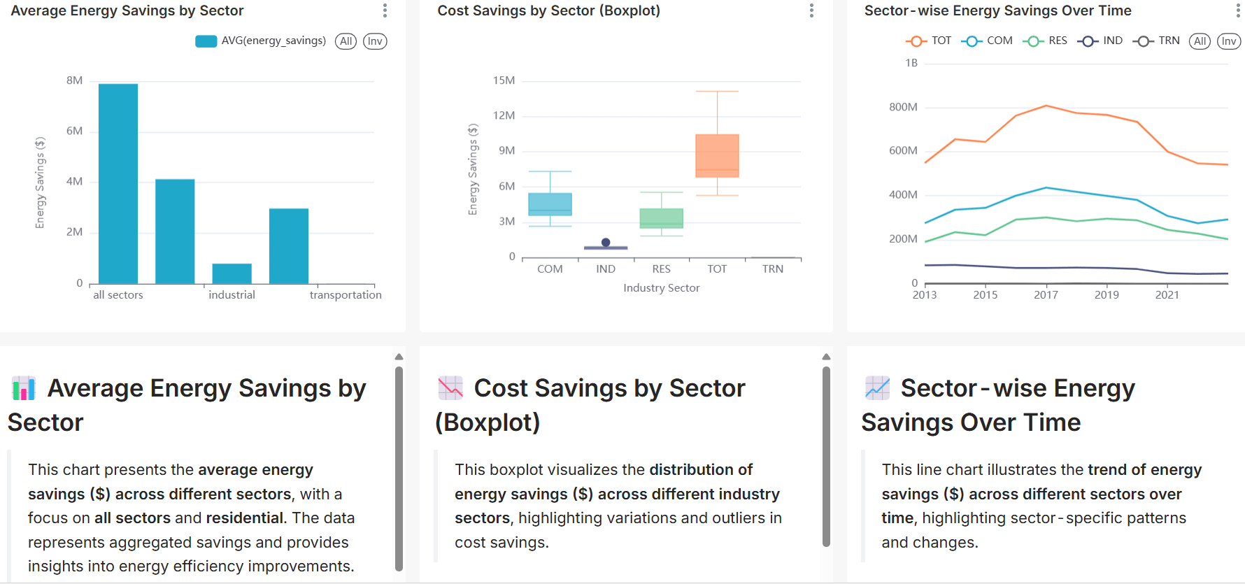
![[OC] Analyzing the Efficacy of Climate Incentives – New Research Platform Majles. (Looking for Feedback!)](https://www.byteseu.com/wp-content/uploads/2025/02/cddxngzps0je1-1536x721.png "[OC] Analyzing the Efficacy of Climate Incentives – New Research Platform Majles. (Looking for Feedback!)")
[OC] Analyzing the Efficacy of Climate Incentives – New Research Platform Majles. (Looking for Feedback!)
Posted by Key-Amphibian5523
3 Comments
[removed]
Hey y’all – I’m one of the founders of http://www.majles.ai – majles is a policy research platform we’re keen to have more people like OP deploy dashboards. We pulled a lot of specific datasets for OPs dashboard and would be happy to do the same for you! You can ping me here or join our slack community through our home page! 🙏🏽
As a dashboard, or generator, this might be fine as the viewer has a more intimate knowledge of the data, but as a dataisbeautiful, infographic, or public presentation, the data suffers from bad annotation.
* The bar chart has four (maybe five?) bar categories, four axis ticks, and three axis labels; it’s very unclear what is unlabeled or missing.
* Sometimes things are called “sectors” and sometimes “industry sector” yet “industrial” seems to be a subset of sectors. Does “industry sector” apply to all sectors, or just the industrial sector? (That’s rhetorical) In the same vein, why does the box plot get an axis label but the bar chart does not?
* Single-category legends aren’t particularly informative or useful and consume space.
* Pet peeve: labels should be capitalized alike.
* The bar chart is uncategorized but has a legend, yet the box plot is categorized without a legend–specifically using acronyms for the categories which are never defined, only implied.
* The bar chart categories have the same issue as the box plot.
* The bar chart not only doesn’t have axis labels, so we can only assume the y-axis is in dollars.
* Why is the chart type documented for the box plot and not the others, or why is it documented at all?
* There seem to be a variable number of categories? Or are they labeled differently per chart? Am I correct to assume that “TOT” is the same as “all sectors”? If so, it should be on the end of the box plot, not mixed in with other specific categories.
* If you have savings data over time, then I must assume that the implied “overall” charts are aggregating some time period; That period should be documented, especially seeing that none of your date axes have an end tick.
* Similarly, the numbers don’t seem to add up–if the upper-end of the total box in the box plot is ≈14M, how is it between 600M-800M per year? There must be some additional (and less obvious) aggregation in the line chart too.
IMO, making the charts consistent seems trivial for an automated service.
I’m sure the data is compelling, but I struggling to uncover any conclusions due to the opaque charting. Again, this might be obvious if your only viewer has configured the dashboard to their own preferences, but as a public post it’s not.