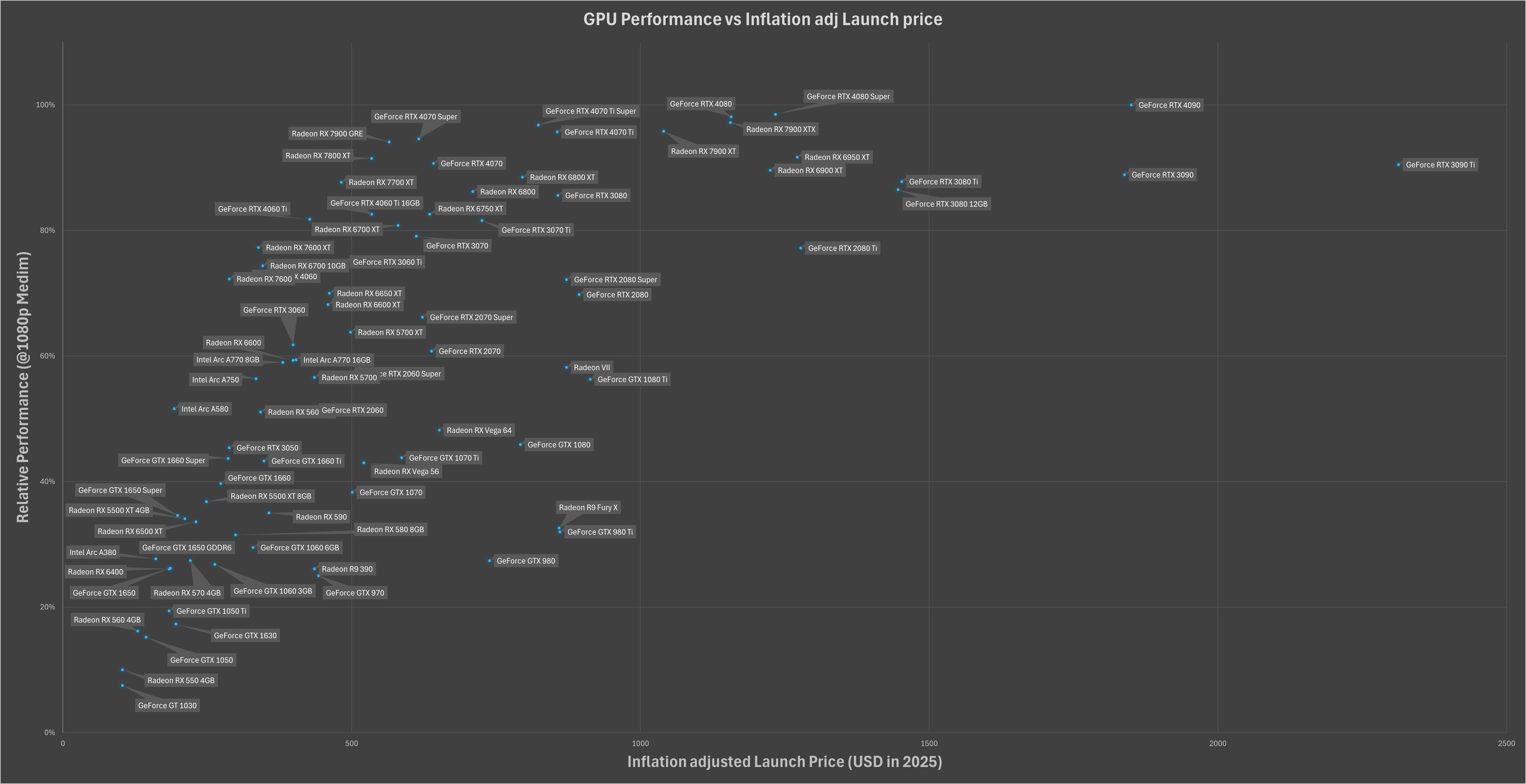
Inspired by some of the chart from yesterday, I plotted GPU performance (Relative 1080p medium settings – data from Tom’s Hardware) against their inflation-adjusted launch prices (from the Bureau of Labor Statistics)
**High-end GPUs** like the RTX 4090 and 3090 Ti dominate performance but come with massive price tags.
**Diminishing returns** are clear at the top end—spending more doesn’t always mean significantly better performance.
here is all of my raw (and not pretty at all) data;
This is awesome. Got a 1070 in 2016. Nice to see that it was relatively speaking, at the time, a price to performance king. Still running it today.
EDIT: Need a 3d plot with 3rd axis by launch date haha
tanknav on
Illegibility is hardly beautiful. More pixels required.
daero90 on
I wish this was easier to read because the information it is presenting is good.
MalaMadre211 on
Could you make a similar chart for 4k? The top GPUs are CPU bottleneck at 1080p
ReflectiveHymn on
Very interesting data, however I would have expected the axes to be flipped (performance in X, price in Y), maybe just me though.
Coldaine on
Relative performance to what? The 4090? This doesn’t show what I think people believe it is showing. It’s basically a timeline as it is presented here.
You probably want uplift over previous generation.
Source: Make power point slides for a living.
Astrogalaxycraft on
So basically the best quality -price option is amd 7800XT
pewbdo on
It’s missing the titan x pascal which is a pretty important card. It was the first pascal architecture titan, came out August 2016 at $1,200 and was beat to shit by the 1080ti on value/performance a few months later. The 5080 I got for $1,000 is a fucking bargain compared to the titan I got day one in 2016.
incomparability on
“Over time”
Provides absolutely no dates on any of the data points

![[OC] GPU Performance vs. Inflation-Adjusted Prices: A Look at Value Over Time](https://www.byteseu.com/wp-content/uploads/2025/02/565rqzwmu3ke1-1536x790.png "[OC] GPU Performance vs. Inflation-Adjusted Prices: A Look at Value Over Time")
10 Comments
Inspired by some of the chart from yesterday, I plotted GPU performance (Relative 1080p medium settings – data from Tom’s Hardware) against their inflation-adjusted launch prices (from the Bureau of Labor Statistics)
**High-end GPUs** like the RTX 4090 and 3090 Ti dominate performance but come with massive price tags.
**Diminishing returns** are clear at the top end—spending more doesn’t always mean significantly better performance.
here is all of my raw (and not pretty at all) data;
[https://docs.google.com/spreadsheets/d/1aCCedmz67MPvvTNhOw4JdduilxstxvoL_c3D8h6FAtA/edit?usp=sharing](https://docs.google.com/spreadsheets/d/1aCCedmz67MPvvTNhOw4JdduilxstxvoL_c3D8h6FAtA/edit?usp=sharing)
This is awesome. Got a 1070 in 2016. Nice to see that it was relatively speaking, at the time, a price to performance king. Still running it today.
EDIT: Need a 3d plot with 3rd axis by launch date haha
Illegibility is hardly beautiful. More pixels required.
I wish this was easier to read because the information it is presenting is good.
Could you make a similar chart for 4k? The top GPUs are CPU bottleneck at 1080p
Very interesting data, however I would have expected the axes to be flipped (performance in X, price in Y), maybe just me though.
Relative performance to what? The 4090? This doesn’t show what I think people believe it is showing. It’s basically a timeline as it is presented here.
You probably want uplift over previous generation.
Source: Make power point slides for a living.
So basically the best quality -price option is amd 7800XT
It’s missing the titan x pascal which is a pretty important card. It was the first pascal architecture titan, came out August 2016 at $1,200 and was beat to shit by the 1080ti on value/performance a few months later. The 5080 I got for $1,000 is a fucking bargain compared to the titan I got day one in 2016.
“Over time”
Provides absolutely no dates on any of the data points