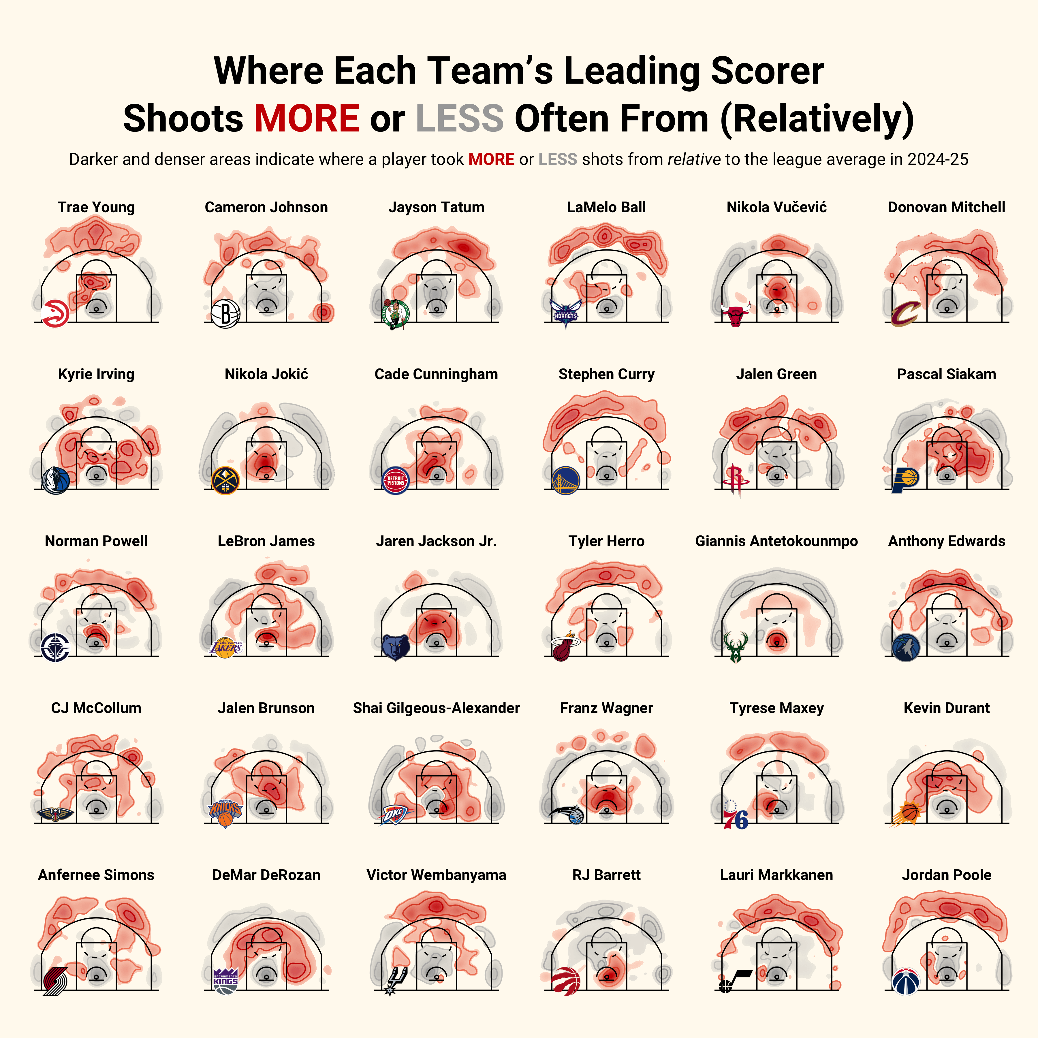
[OC] Where each NBA team’s leading scorer likes (and dislikes) shooting from relative to league average
Posted by llewellynjean

![[OC] Where each NBA team's leading scorer likes (and dislikes) shooting from relative to league average](https://www.byteseu.com/wp-content/uploads/2025/02/v5rsljn2scke1-1536x1536.png "[OC] Where each NBA team’s leading scorer likes (and dislikes) shooting from relative to league average")
[OC] Where each NBA team’s leading scorer likes (and dislikes) shooting from relative to league average
Posted by llewellynjean
10 Comments
The chart is from my NBA & data viz newsletter [The F5](https://thef5.substack.com/p/hot-shots)
The darker and denser the red area, the more often the corresponding player shoots from that location relative to the rest of the league. Meanwhile, the gray areas indicate the areas where a player shoots from less often relative to their peers. The areas with no color are just the spots where that player’s shot selection mirrors the average player’s shot selection.
I made this chart in R with ggplot2 and am happy to answer any questions anyone might have
Love the contrast of RJ Barrett and Giannis Antetokounmpo with everyone else
Pascal Siacam doesn’t care where he is. If he has the ball inside the 3-pt line, he can score it.
It’s crazy to see so many ex-raptors on there. Super cool charts, thanks for sharing.
Great chart! It’d be nice to see if there is any correlation between height and shoot position 🤔
This is awesome!
I like seeing variability between teams in visualizations like this. It really pushes back on the popular notion that there’s not enough difference in offense these days – which simply isn’t true if you’re actually watching lots of games, or looking at good data!
ETA: Just read the first paragraph of your blog post after writing this and I couldn’t agree more!
Incredible visualization.
My only feedback is that i want more! Would love to see this across different cuts (by position, by team, different years, etc.) if possible.
Surprised to see the concentration of 3’s for Victor W.
You would think he would take most of his shots in the paint with how tall he is.
Interesting data, not a fan of how the team logo covers part of the data though
Sad that Wemby never went to the rim