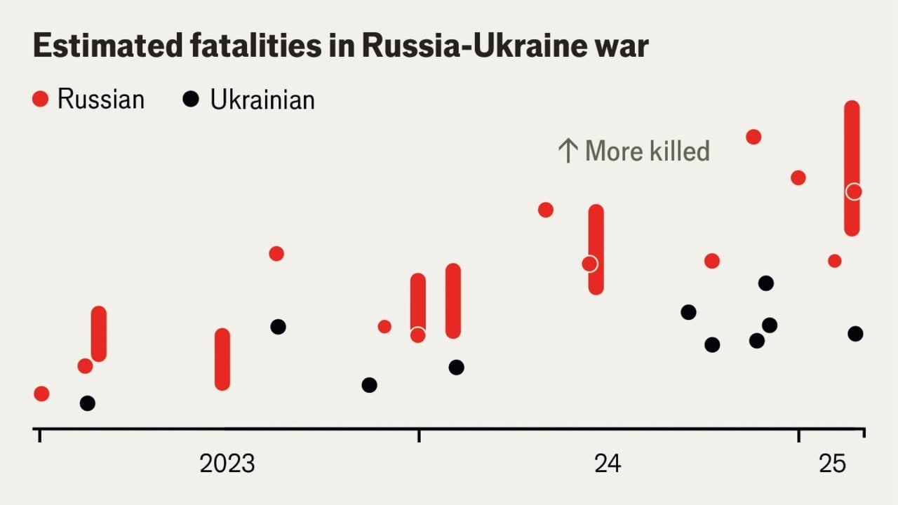
Share Facebook Twitter LinkedIn Pinterest Bluesky Threads How do Ukrainian soldier fatalities compare with Russia’s? Posted by statisticalanalysis_
outlaw1148 on March 7, 2025 10:43 am This might be some of the worst data presentation I have seen? Is that 1 worm or 25 chickens per bar?
AdrianRP on March 7, 2025 10:44 am I assume the y axis is plotted in the whole graph, but it requieres a free trial to even check so… Not very beautiful


2 Comments
This might be some of the worst data presentation I have seen? Is that 1 worm or 25 chickens per bar?
I assume the y axis is plotted in the whole graph, but it requieres a free trial to even check so… Not very beautiful