Colors are too close, I can’t differentiate multiple types.
Mirar on
Trying to match the colours with my eyes, but I really can’t match the graph to the side colours. I guess I got colourblind…
LightBringer81 on
These solar numbers are rookie numbers, you need to pump those numbers up!
ILoveAllGolems on
Please, seasonally adjust it
KAugsburger on
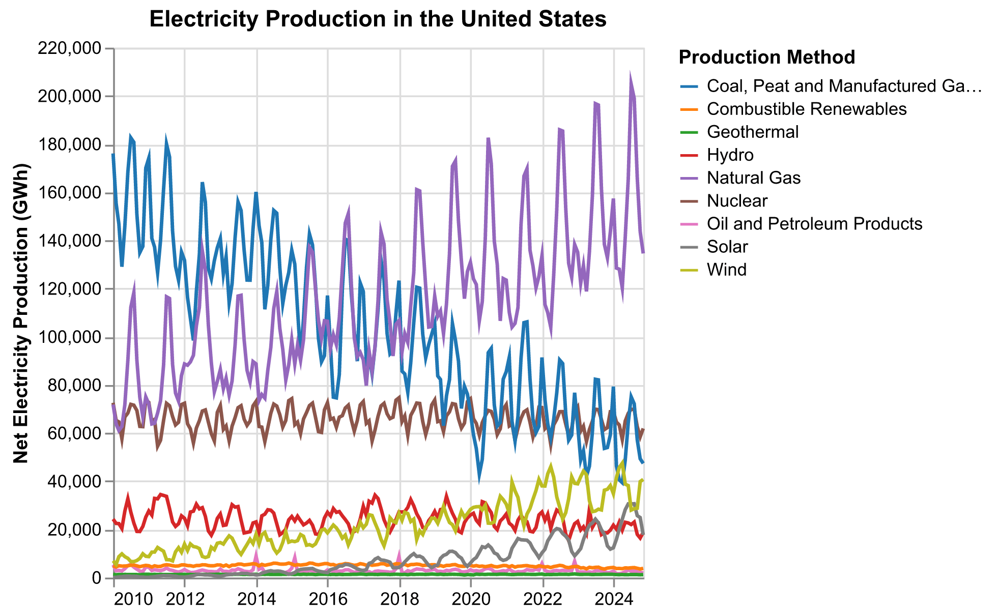
A couple suggestions. I would just average all the months in the same year together so that you can more easily see the general trend over the years. Most people are more interested in the year to year trends than seeing the seasonal variations that your chart is showing. I would also either drop either drop geothermal, combustible renewables, and oil and petroleum products or aggregate them into an ‘other’ category. They are too close to each other to easily distinguish each one and they are all very close to 0%. It makes the graph much more crowded and makes it harder to pick colors that contrast well with each other.

![[OC] Electricity Production in the United States](https://www.byteseu.com/wp-content/uploads/2025/03/ixw3ydmahene1-1536x949.png "[OC] Electricity Production in the United States")
10 Comments
Source: [https://www.iea.org/data-and-statistics/data-product/monthly-electricity-statistics?utm_campaign=IEA+newsletters&utm_medium=Email&utm_source=SendGrid#documentation](https://www.iea.org/data-and-statistics/data-product/monthly-electricity-statistics?utm_campaign=IEA+newsletters&utm_medium=Email&utm_source=SendGrid#documentation)
Citation: IEA, Monthly Electricity Statistics, IEA, Paris [https://www.iea.org/data-and-statistics/data-product/monthly-electricity-statistics](https://www.iea.org/data-and-statistics/data-product/monthly-electricity-statistics), Licence: Terms of Use for Non-CC Material
Tools used: Python, pandas, Vega-Altair
Didn’t think that there is such a tendency for gas.
How do you not use yellow for solar?
The legend should match the order of the lines.
Not beautiful.
This is how to do it better. [https://explore.openelectricity.org.au/energy/sa1/?range=7d&interval=30m&view=discrete-time&group=Detailed](https://explore.openelectricity.org.au/energy/sa1/?range=7d&interval=30m&view=discrete-time&group=Detailed)
Colors are too close, I can’t differentiate multiple types.
Trying to match the colours with my eyes, but I really can’t match the graph to the side colours. I guess I got colourblind…
These solar numbers are rookie numbers, you need to pump those numbers up!
Please, seasonally adjust it
A couple suggestions. I would just average all the months in the same year together so that you can more easily see the general trend over the years. Most people are more interested in the year to year trends than seeing the seasonal variations that your chart is showing. I would also either drop either drop geothermal, combustible renewables, and oil and petroleum products or aggregate them into an ‘other’ category. They are too close to each other to easily distinguish each one and they are all very close to 0%. It makes the graph much more crowded and makes it harder to pick colors that contrast well with each other.