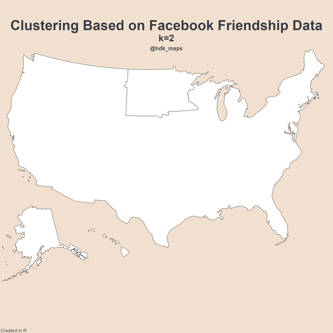
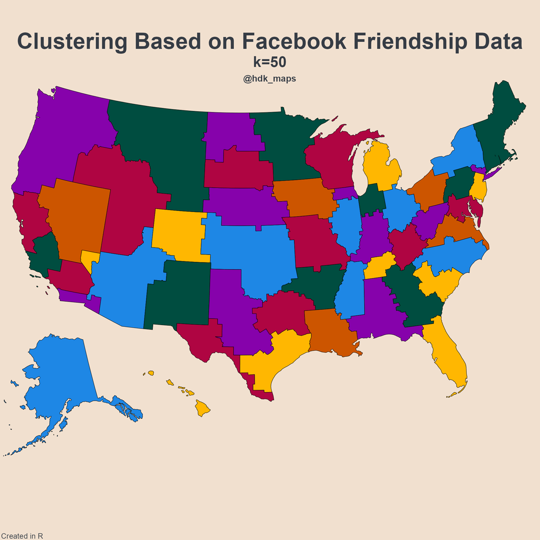
I created an animation of hierarchical clustering of the US into friendship networks from 2 to 50 clusters. The clusters show areas which are more tightly linked in terms of friendships (high probability of friendship). The white regions in the animation are the two regions that were created by the most recent split.
The data are at the county level, so counties are never split across clusters.
MaxSupernova on
Now THIS is interesting data. What a cool way to look at Facebook friend info.
Really interesting to look at what areas share friendships, and which ones don’t (or share less).
Appropriate_Lynx4119 on
Speaking as a Minnesotan, it’s absolutely wild to me that us (and the Dakotas, apparently) are SO distinct that the very *first* geographical carve out is MN + the Dakotas vs. Everyone Else, instead of like, East vs. West or something.
vtnate on
It’s fascinating that many of the clusters are very much based on states, but some are not. New England being so well defined is exciting to me.
Dhan996 on
I’m a bit lost (not a data science expert).
Are friendship networks supposed to mean who people are friends with according to state? As in you go through the friends list and categorize by location? Or is it more so the posts and where they come from?
I guess what I’m asking is please explain like I’m 5.
MattSolo734 on
What I think is super interesting, if you look at the northern border of North Carolina, there’s a little carve-out that appears to be Patrick and Henry Counties in Virginia. I’m FROM that carve-out and now live in the middle of NC, and it’s wild to imagine that, “born on the NC border in two counties that were hit hard in the 90s, went to college then moved south to find work just as Facebook was dragging us in (and our families)” was pronounced to show up here.
Then you go back and look at other similar little carve-outs on state borders: one in MO/AR, another in ND/NB. It makes me wonder about those, given what I know about my own.
Numerous_Recording87 on
I think the last frame looks like the first cut of a US map with more sensible state boundaries, based more on human geography.
JakeShropshire on
There’s something to be said about just how badly people avoid being friends with Texans if you’re not already in Texas.
TrynnaFindaBalance on
Would be really interesting to see this with county/state lines superimposed.
Radical_Coyote on
All of this and we STILL have two Dakotas
atgrey24 on
I’m honestly surprised that NJ is all in one region instead of being split into NY/Philly Metro areas.
My guess is that Long Island is too tightly knit and pulls the rest of the city + lower NY with it?
What are you using to define the borders? County boundaries?
silent-farter on
So interesting how state lines become visible!
Intrepid-Kale1936 on
So what are we looking at here, are each of these slides a map of regions with the highest instances of friendship occurrences?
What does the K value signify? Example when K = 2, only the region around North& South Dakota & Minnesota is highlighted – does that mean that area was used as a starting area, or that its significantly different from the rest of the states / most unique or isolated from friendships back to the rest of the state areas?
okram2k on
I guess this proves that the UP does in fact belong to Wisconsin.
jay_altair on
I am surprised that no part of CT got lumped in with NYC/Long Island
Popple06 on
Really fascinating how many states are clearly visible, how many get combined, and how many get divided up. Great work!
DrNO811 on
Apparently, that’s how state lines should be drawn.
cbarrick on
How granular is the location data?
The clusters look to be county level at the finest. Is that because the data is county level, or are the clusters naturally county level? Or am I wrong about this observation all together?
The reason I ask is because county level granularity isn’t uniform across the country. It’s much more fine grained in the east than the west.
ProbaDude on
Extremely cool data! Never thought about geographical hierarchical clustering like this before but it’s really cool
flunky_the_majestic on
Looks like a new way to establish representational districts.
PopOk3624 on
Love this. To be clear, what analyses did you run to find optimum k, and what was the result?
Edit: and which do you think gave most intuitivelyinterpretable results?
turbotang on
I’m glad to see the distinct split of the Pittsburgh vs Philly rivalry.
Ok-disaster2022 on
Honestly this looks like a more equitable state map than the current state lines. Small and large states are mostly minimized
bstmichael on
Did anyone else catch that the first division in the East Coast is between North and South? The initial regional divisions are interesting too.
The_Box_muncher on
The disconnect in Illinois being north of 80 and south of 80 is very funny.

![[OC] Hierarchical Clustering of the US Based on Facebook Friendships](https://www.byteseu.com/wp-content/uploads/2025/03/myvf0lms23oe1-1024x1024.gif "[OC] Hierarchical Clustering of the US Based on Facebook Friendships")
25 Comments
Data: [https://dataforgood.facebook.com/dfg/tools/social-connectedness-index#accessdata](https://dataforgood.facebook.com/dfg/tools/social-connectedness-index#accessdata)
Tools: R, Packages: dplyr, ggplot2, sf, usmap, tools, ggfx, gifski, scales
I created an animation of hierarchical clustering of the US into friendship networks from 2 to 50 clusters. The clusters show areas which are more tightly linked in terms of friendships (high probability of friendship). The white regions in the animation are the two regions that were created by the most recent split.
Edit:
k=75 and k=100: [https://www.reddit.com/user/haydendking/comments/1j8v5jr/hierarchical_clustering_of_the_us_based_on/](https://www.reddit.com/user/haydendking/comments/1j8v5jr/hierarchical_clustering_of_the_us_based_on/)
State lines superimposed (suggested by u/sdb00913 and u/TrynnaFindaBalance):
[https://www.reddit.com/user/haydendking/comments/1j8v6ht/hierarchical_clustering_of_the_us_based_on/](https://www.reddit.com/user/haydendking/comments/1j8v6ht/hierarchical_clustering_of_the_us_based_on/)
The data are at the county level, so counties are never split across clusters.
Now THIS is interesting data. What a cool way to look at Facebook friend info.
Really interesting to look at what areas share friendships, and which ones don’t (or share less).
Speaking as a Minnesotan, it’s absolutely wild to me that us (and the Dakotas, apparently) are SO distinct that the very *first* geographical carve out is MN + the Dakotas vs. Everyone Else, instead of like, East vs. West or something.
It’s fascinating that many of the clusters are very much based on states, but some are not. New England being so well defined is exciting to me.
I’m a bit lost (not a data science expert).
Are friendship networks supposed to mean who people are friends with according to state? As in you go through the friends list and categorize by location? Or is it more so the posts and where they come from?
I guess what I’m asking is please explain like I’m 5.
What I think is super interesting, if you look at the northern border of North Carolina, there’s a little carve-out that appears to be Patrick and Henry Counties in Virginia. I’m FROM that carve-out and now live in the middle of NC, and it’s wild to imagine that, “born on the NC border in two counties that were hit hard in the 90s, went to college then moved south to find work just as Facebook was dragging us in (and our families)” was pronounced to show up here.
Then you go back and look at other similar little carve-outs on state borders: one in MO/AR, another in ND/NB. It makes me wonder about those, given what I know about my own.
I think the last frame looks like the first cut of a US map with more sensible state boundaries, based more on human geography.
There’s something to be said about just how badly people avoid being friends with Texans if you’re not already in Texas.
Would be really interesting to see this with county/state lines superimposed.
All of this and we STILL have two Dakotas
I’m honestly surprised that NJ is all in one region instead of being split into NY/Philly Metro areas.
My guess is that Long Island is too tightly knit and pulls the rest of the city + lower NY with it?
What are you using to define the borders? County boundaries?
So interesting how state lines become visible!
So what are we looking at here, are each of these slides a map of regions with the highest instances of friendship occurrences?
What does the K value signify? Example when K = 2, only the region around North& South Dakota & Minnesota is highlighted – does that mean that area was used as a starting area, or that its significantly different from the rest of the states / most unique or isolated from friendships back to the rest of the state areas?
I guess this proves that the UP does in fact belong to Wisconsin.
I am surprised that no part of CT got lumped in with NYC/Long Island
Really fascinating how many states are clearly visible, how many get combined, and how many get divided up. Great work!
Apparently, that’s how state lines should be drawn.
How granular is the location data?
The clusters look to be county level at the finest. Is that because the data is county level, or are the clusters naturally county level? Or am I wrong about this observation all together?
The reason I ask is because county level granularity isn’t uniform across the country. It’s much more fine grained in the east than the west.
Extremely cool data! Never thought about geographical hierarchical clustering like this before but it’s really cool
Looks like a new way to establish representational districts.
Love this. To be clear, what analyses did you run to find optimum k, and what was the result?
Edit: and which do you think gave most intuitivelyinterpretable results?
I’m glad to see the distinct split of the Pittsburgh vs Philly rivalry.
Honestly this looks like a more equitable state map than the current state lines. Small and large states are mostly minimized
Did anyone else catch that the first division in the East Coast is between North and South? The initial regional divisions are interesting too.
The disconnect in Illinois being north of 80 and south of 80 is very funny.