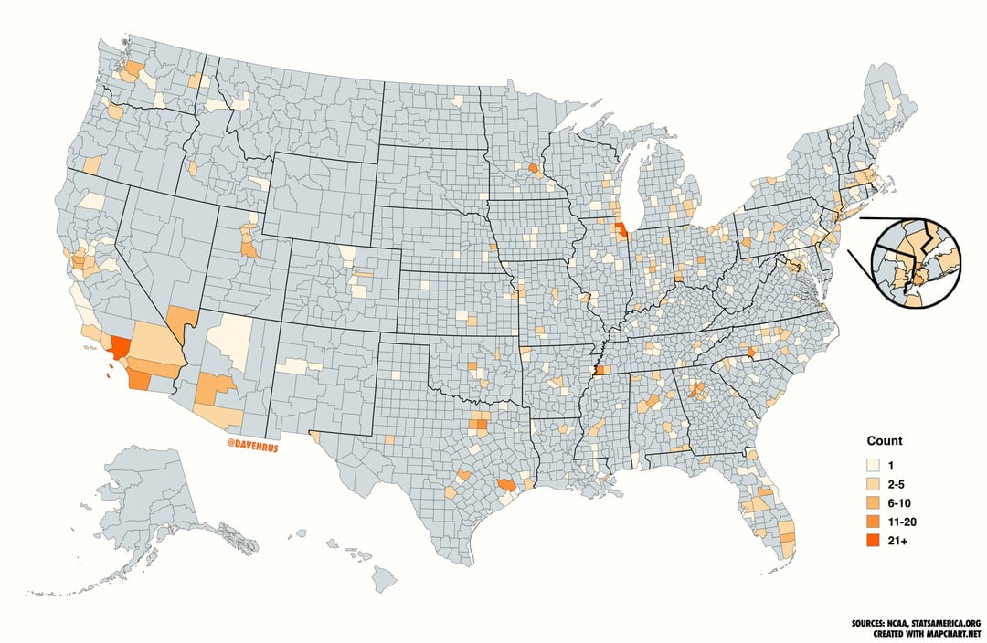
[OC] The Hometown of Every American Player in the 2025 Men’s March Madness Tournament by County/Parish
Posted by dvd5671

![[OC] The Hometown of Every American Player in the 2025 Men's March Madness Tournament by County/Parish](https://www.byteseu.com/wp-content/uploads/2025/03/09yzl114uape1-1024x667.jpg "[OC] The Hometown of Every American Player in the 2025 Men’s March Madness Tournament by County/Parish")
[OC] The Hometown of Every American Player in the 2025 Men’s March Madness Tournament by County/Parish
Posted by dvd5671
7 Comments
**Sources:** NCAA, Google Maps, ESPN, [statsamerica.org](http://statsamerica.org), Wikipedia for certain cities/towns not listed in Stats America
**Tools:** [Mapchart.net](http://Mapchart.net), Photoshop, Google Sheets
[Here is the Sheets link of all of the hometowns](https://docs.google.com/spreadsheets/d/1oLesrjP5xdEa70zaPemcNPBB0c4-ylxBuruPjxNvyDs/edit?usp=sharing)
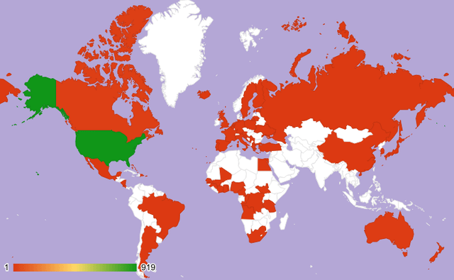
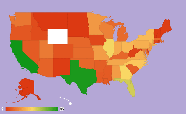
Second graph is a r/graphcrime
gonna leave this here [https://www.xkcd.com/1138/](https://www.xkcd.com/1138/)
[deleted]
2nd chart is just bad. It’s wild that people can produce something like that and then think it’s worth sharing. Like you were in a race to post and had to get it out immediately, every country looks the same? Whatever, good enough.
1st chart is just a population heat map. It doesn’t really tell us anything but which counties are heavily populated.
Overall a big miss here.
First image is r/peopleliveincities
California and Chicago holding it down