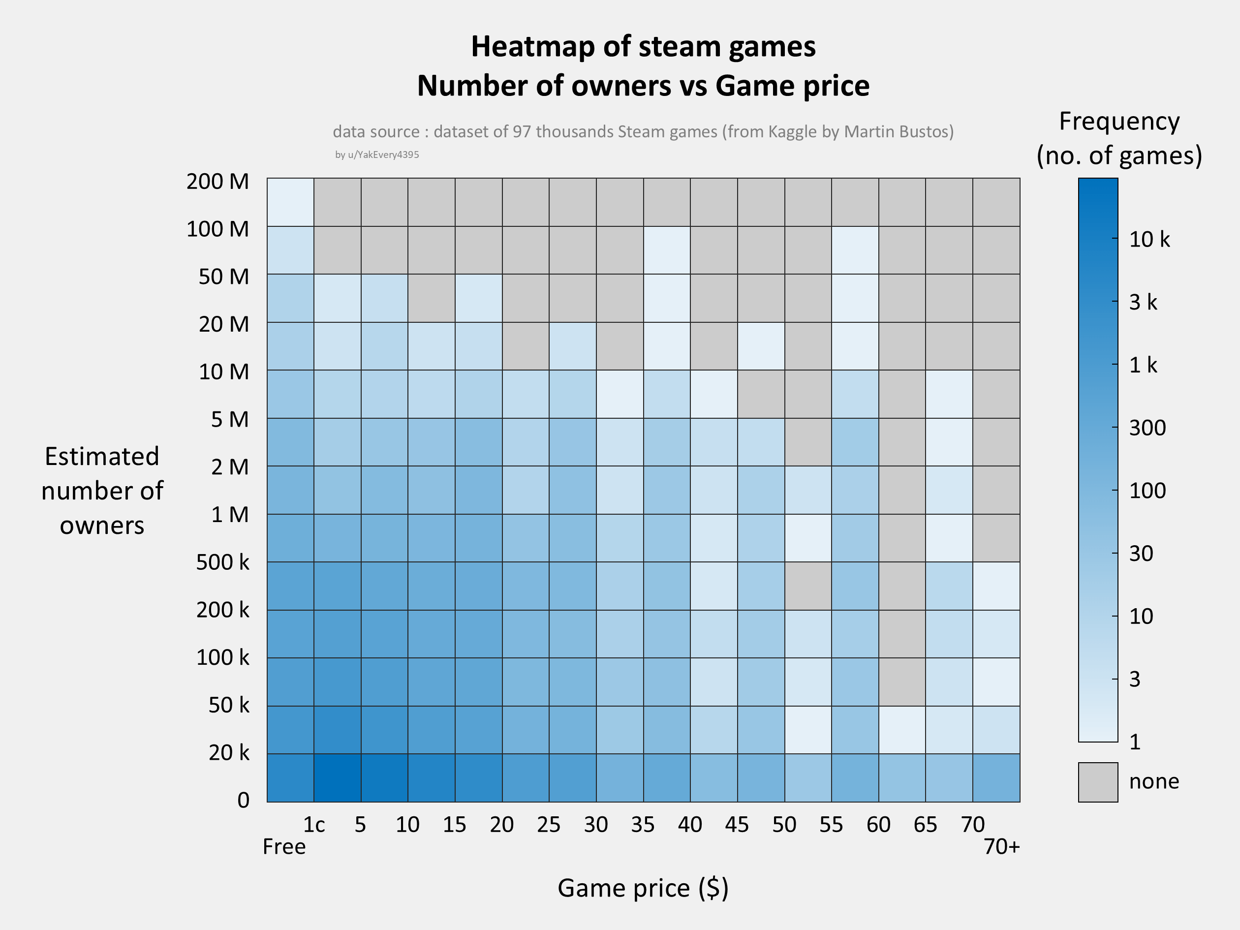
The axis labels are weirdly placed and you should probably normalise y in some way for number of games offered at said price so you dont get those spikes at €40, 60. Then the figure would be more informative.
fs2222 on
Game price would be better as brackets rather than individual prices. A lot of games are sold at $60 but few at $55 for example. Those could be grouped together.
iamevpo on
Seems there are more games at 49.99 rather than 44.99.great graphics though
ThinNeighborhood2276 on
Interesting visualization! It would be great to see if there are any noticeable trends or clusters in the data.
XkF21WNJ on
I get what you’re going for, but I’m not sure if this is really all that easier to read than a simple scatter plot.
cryptotope on
Are the alternating peaks (35-40, 45-50, 55-60) and troughs (30-35, 40-45, 50-55) due to ‘psychological pricing’?
That is, games priced at $39.95, $49.95, $59.95, instead of $40, $50, or $60?
H_Lunulata on
My takeaway: You can sell a half-million of about anything on Steam for $20 or less. That’s up to $10 million on the table…

![[OC] Heatmap of steam games, number of owners vs Game price](https://www.byteseu.com/wp-content/uploads/2025/03/6y3tvbdaxure1-1536x1152.png "[OC] Heatmap of steam games, number of owners vs Game price")
8 Comments
Data source : [https://doi.org/10.34740/kaggle/ds/2109585](https://doi.org/10.34740/kaggle/ds/2109585) and ultimatly, data requests to Steam
Tool : Matlab + Powerpoint
The axis labels are weirdly placed and you should probably normalise y in some way for number of games offered at said price so you dont get those spikes at €40, 60. Then the figure would be more informative.
Game price would be better as brackets rather than individual prices. A lot of games are sold at $60 but few at $55 for example. Those could be grouped together.
Seems there are more games at 49.99 rather than 44.99.great graphics though
Interesting visualization! It would be great to see if there are any noticeable trends or clusters in the data.
I get what you’re going for, but I’m not sure if this is really all that easier to read than a simple scatter plot.
Are the alternating peaks (35-40, 45-50, 55-60) and troughs (30-35, 40-45, 50-55) due to ‘psychological pricing’?
That is, games priced at $39.95, $49.95, $59.95, instead of $40, $50, or $60?
My takeaway: You can sell a half-million of about anything on Steam for $20 or less. That’s up to $10 million on the table…