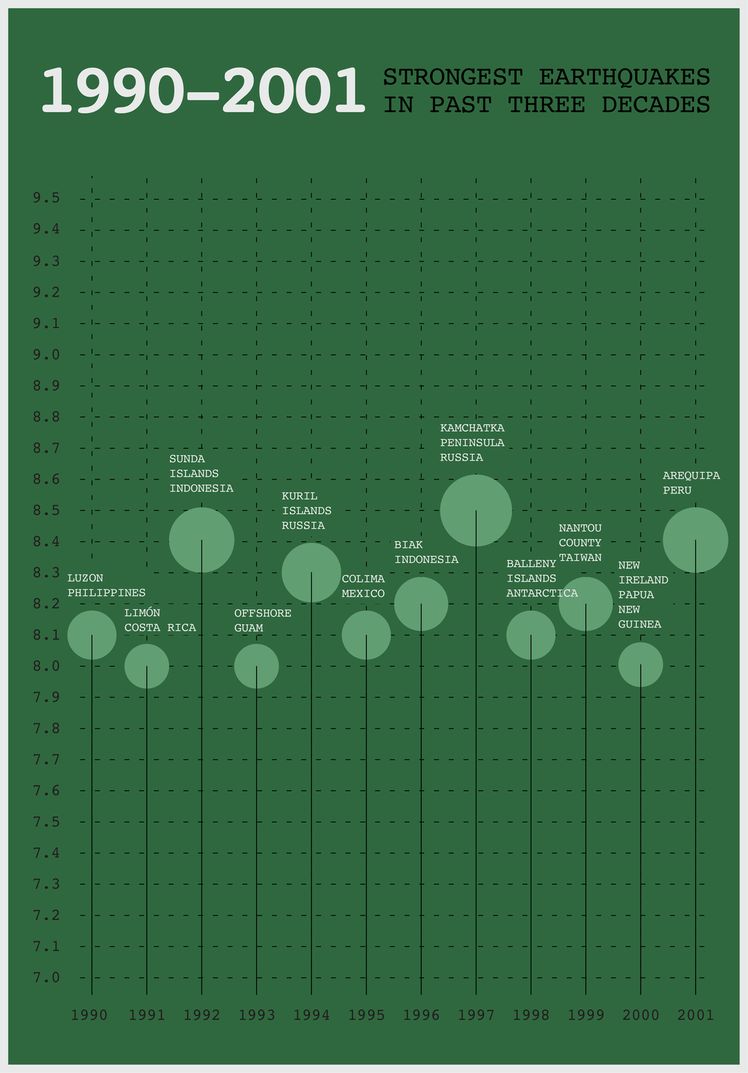
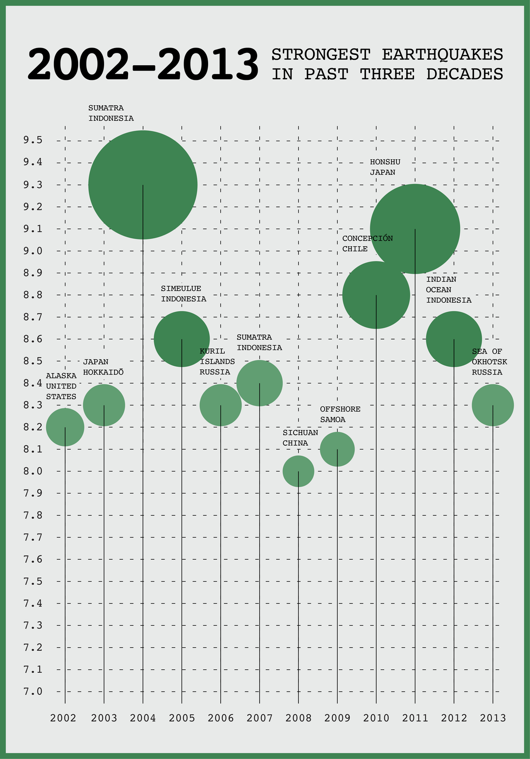
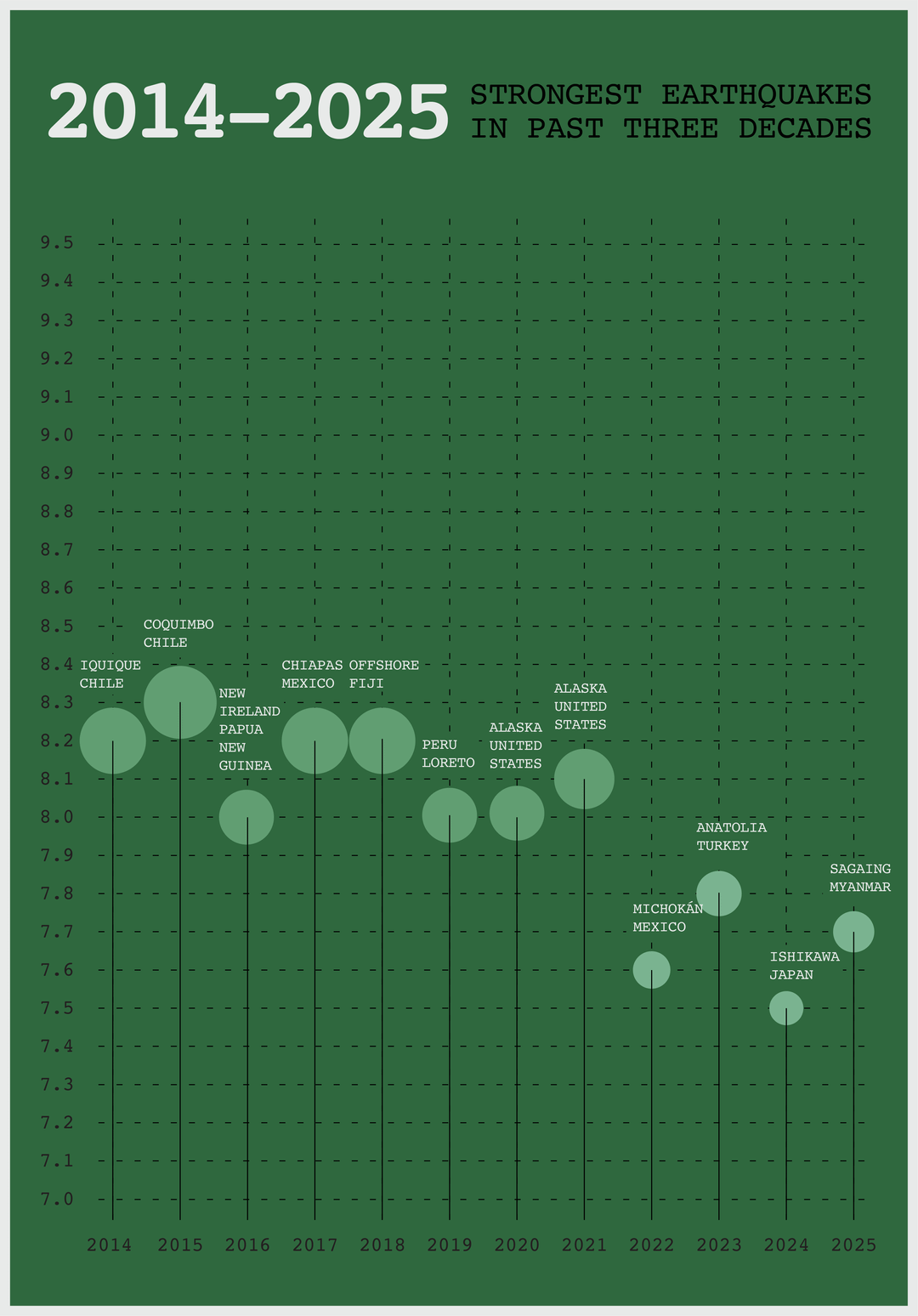
I made this data-visualization exploring the strongest earthquakes in the last 35 years.
Data Source: https://en.wikipedia.org/wiki/Lists_of_earthquakes#Largest_earthquake_by_magnitude_each_year_since_1907
Posted by raheelmalkan

![[OC] Strongest Earthquakes in the Past Three Decades](https://www.byteseu.com/wp-content/uploads/2025/04/phb9rd9453se1-1072x1536.png "[OC] Strongest Earthquakes in the Past Three Decades")
I made this data-visualization exploring the strongest earthquakes in the last 35 years.
Data Source: https://en.wikipedia.org/wiki/Lists_of_earthquakes#Largest_earthquake_by_magnitude_each_year_since_1907
Posted by raheelmalkan
15 Comments
If you go by peak ground acceleration, then the northridge quake wins for 1994. Was there and shit was insane.
It’s insane how powerful the 2004 Earthquake was
Maybe don’t go to Indonesia for the summer?
Are the circles scaled properly? The magnitudes are logarithmic.
I love the style of graph, it’s refreshing to see. If I might suggest an improvement, it would be making the x and the y axis labelling in white colour too against the green background. Otherwise very nice design!
wow there wasn’t a earthquake with higher than 8.4 magnitude for 12 years
Yay for a trend in the right direction over the last decade! This implies that the quakes should soon stop.
Do an overlay of the Sunspot cycle tracking. Appears higher earthquake trends happen at “solar maximum” where more sunspots appear due to the sun’s activity (it flips magnetic poles every 11 years).
We are currently in a “solar maximum” cycle.
.
Missing April 3, 2024 in Taiwan. 7.4.
https://en.wikipedia.org/wiki/2024_Hualien_earthquake
Edit: after reading other comments, seems that the thread title is misleading. The data shown is the strongest earthquake of each year.
Decade is 10 years, not 12.
Crazy that the Christchurch earthquake caused so much damage and it wouldn’t even make it onto the chart
Great visualization! Did you notice any trends or patterns in the locations or frequencies of these strong earthquakes over the past 35 years?
it’s refreshing to finally see a set of world data that isn’t being affected by global warming. lol
[https://en.wikipedia.org/wiki/1960_Valdivia_earthquake#/media/File:Graph_of_largest_earthquakes_1906-2005.png](https://en.wikipedia.org/wiki/1960_Valdivia_earthquake#/media/File:Graph_of_largest_earthquakes_1906-2005.png)
This is one my favorite earthquake visuals, showing the total energy released. Remember that earthquake events are on a logarithmic scale, so the ‘total energy’ of quakes is dominated by a few massive events.
I’m hoping the PNW doesn’t become this decades “big one.” We are not ready for one at all, since the last megathrust happened back in 1700 and is only recorded in trees and oral history.
Our infrastructure is about as prepared for earthquakes as Texas is for blizzards. That one in 1700 was potentially as high as 9.2, and the Tsunami wiped out natives all along the coast and river.