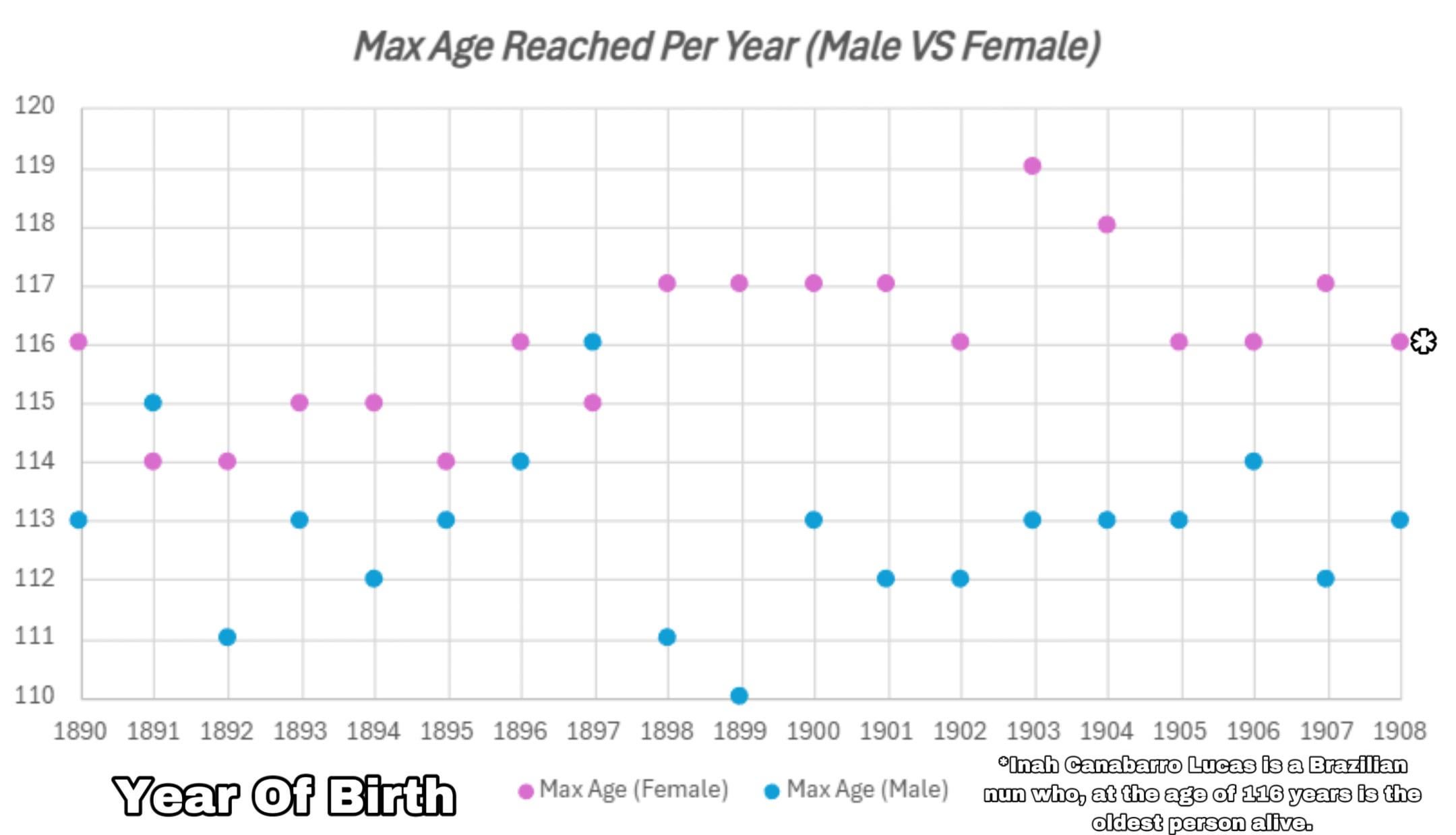
Each year represents the maximum lifespan reach by a person born in that year.
SOURCE: https://gerontology.fandom.com/wiki/Oldest_validated_person_by_year_of_birth
TOOLS: EXCEL
Posted by JakeIsAwesome12345

![Maximum Age reached by year of birth [OC]](https://www.byteseu.com/wp-content/uploads/2025/04/gqoptxk1a6se1-1536x881.jpeg "Maximum Age reached by year of birth [OC]")
Each year represents the maximum lifespan reach by a person born in that year.
SOURCE: https://gerontology.fandom.com/wiki/Oldest_validated_person_by_year_of_birth
TOOLS: EXCEL
Posted by JakeIsAwesome12345
5 Comments
Interesting visualization! It would be great to see any trends or patterns in the data over time.
Proves the point,why do men die before women?
Answer: because they want to!
Am I stupid or is the change from 1902 to 1903 impossible?
Edit to add: The change for women
Edit 2: I did not read the chart description properly, please ignore
Why did I just check the graph for my year of birth?
Any chance you could extend it to include the 1920’s?