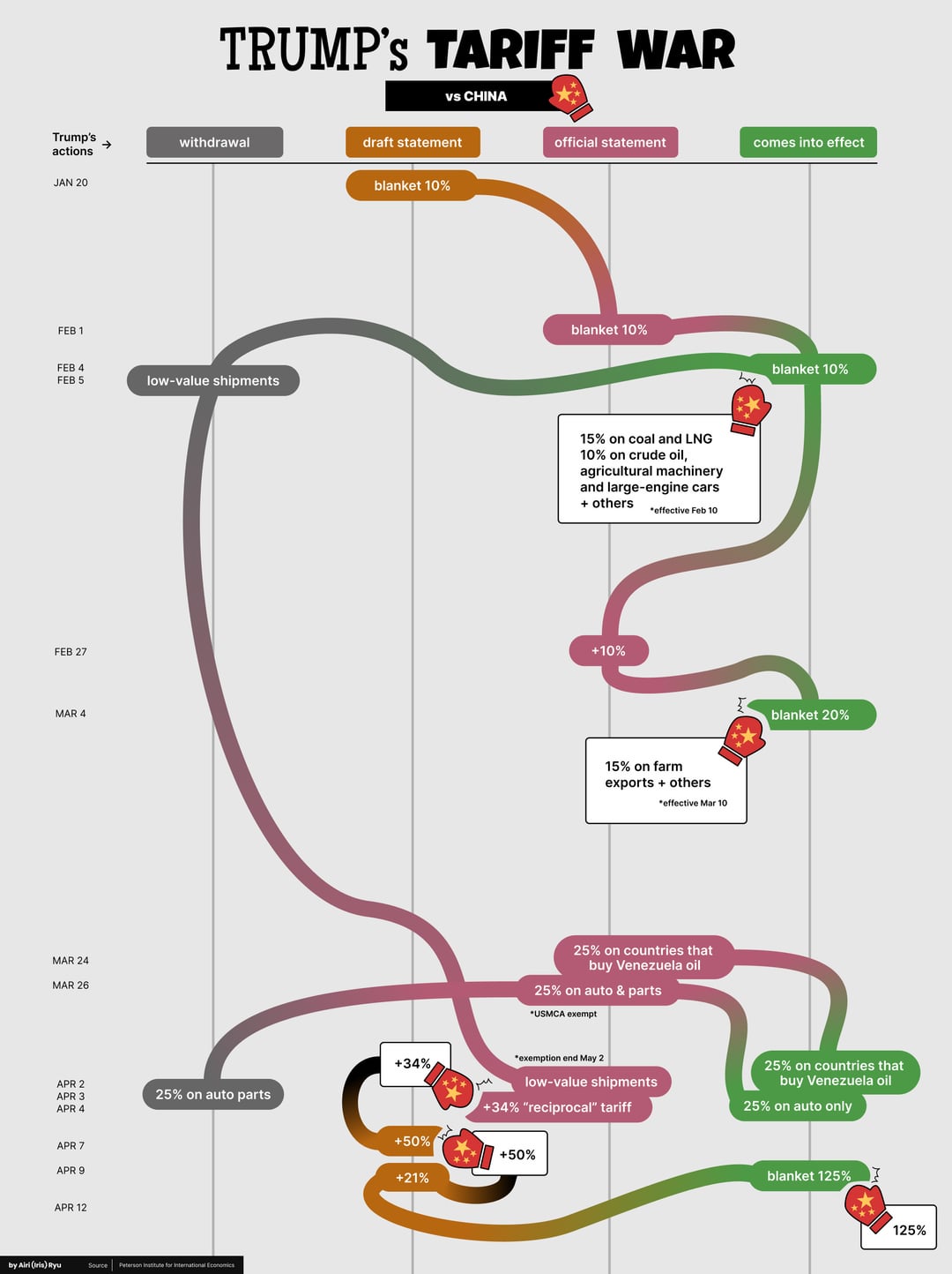
Data source used: Peterson Institute for International Economics
Link to source: https://www.piie.com/blogs/realtime-economics/2025/trumps-trade-war-timeline-20-date-guide
Tool used: Figma
Posted by thelastdinostanding

![Trump Tariff War (as of April 17th) [OC]](https://www.byteseu.com/wp-content/uploads/2025/04/mifoh557dfve1-766x1024.jpg "Trump Tariff War (as of April 17th) [OC]")
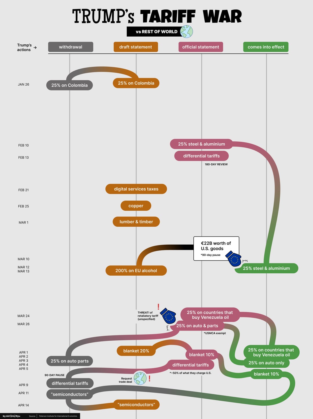
Data source used: Peterson Institute for International Economics
Link to source: https://www.piie.com/blogs/realtime-economics/2025/trumps-trade-war-timeline-20-date-guide
Tool used: Figma
Posted by thelastdinostanding
38 Comments
This would make a good DnD dungeon. Plus, it gets constant updates!
This whole thing is extremely poorly made. Is there an adjacent “data is ugly” sub?
This is v confusing to read
These charts are very confusing and hard to follow, but i think thats kinda the whole point.
The best thing about this is how it shows how stupid this whole situation is.
This chart is starting to look like Rainbow Road
At this point I believe Trump just does what the last person that talked to him told him to do
Is that what a concept of a plan looks like?
It is fitting that these resemble the route that Billy from the Family Circus takes when Mom calls him.
What a terribly confusing illustration
As much as it wouldn’t follow reddits display format, this would be much better as a uniform timeline either as an image or better as a web page.
On page 2 differential tariffs are not ‘~50 % of what they charge us’
Is it intentional that each of these graphs looks like intestines?
I drew something on my Etch a Sketch. Then I turned it into a global economic policy.
Now I’m hungry.
„When you go all-in, always fold after call.”
Buck Tzu, Art of trade war
You mean as of April 14th. It’s up to 245% for China now.
date should be on the x axis, with “Trump’s actions” i.e. level of effect on the y
He’s [driving the economy like a stolen car](https://colinmaclaughlin.substack.com/p/driving-the-economy-like-a-stolen).
This certainly isn’t charts are beautiful, I gave up reading it lol
This chart did not help me.
This is beautiful data right? I seems to have stumbled upon ugly data
WTF, this about as fucked up as the tariff implementation.
But as mentioned numerous times, I think that’s the point of the charts, wether they’re accurate or not
Bad Visualization. Too unclear.
Most executives make announcements once a formula has been finalized. This shows Trump likes to blab right after a whiteboard session.
Is this the weave he’s always talking about doing?!
Though China tariffs were now on their way to 245% ? Unless that was just yesterday’s fake news, the China page needs an update in the draft or statement columns.
This whole thing is starting to feel lile r/polandballs strip
This is a chart like my toilet is not full of diarrhea. You can’t follow actions with time with fucking things going backwards in time.
Make five separate or six separate graphs for each one shocking.
This would look more accurate if it was scribbled in crayon
confusing to read but the chinese boxing gloves are hilarious lolol
I never knew other countries had such high tariffs on US goods!
There’s gotta be a better way to plot this data lmao.
congratz!.. nobody can’t confuse people more than these charts about tariffs.. you can blame even alaska (!) with these noodles.. damned why did you spend time for these ugliest goblin charts…
Putting time on the y-axis has to be a crime.
I do like the creativity behind the chart. My one issue with it is that the description of “differential tariffs” (ie the most important decision on here) is wholly incorrect.
The tariffs were not “~50% of what they charge the US”; they were “half of the goods deficit with the US”, and the calculated tariff had literally nothing to do with what tariff the other country did or did not apply to the US.
At least grateful you didn’t use the misleading “reciprocal” tariff to describe them!
I love this. It’s like a Jackson Pollock of Economic Policy.
Who in their right mind thought this would be a useful way to portray this data?
25% tariff on countries that buy Venezuela oil (slide 2)….
[The U.S. buys Venezuela oil](https://www.eia.gov/dnav/pet/hist/LeafHandler.ashx?n=pet&s=mttimusve2&f=m)…. Are they going to tariff themselves?