[OC] Inflation-adjusted pre-tax income, among Americans aged 25-29 in the labor force, by percentile: 1962–2024
Posted by JeromesNiece

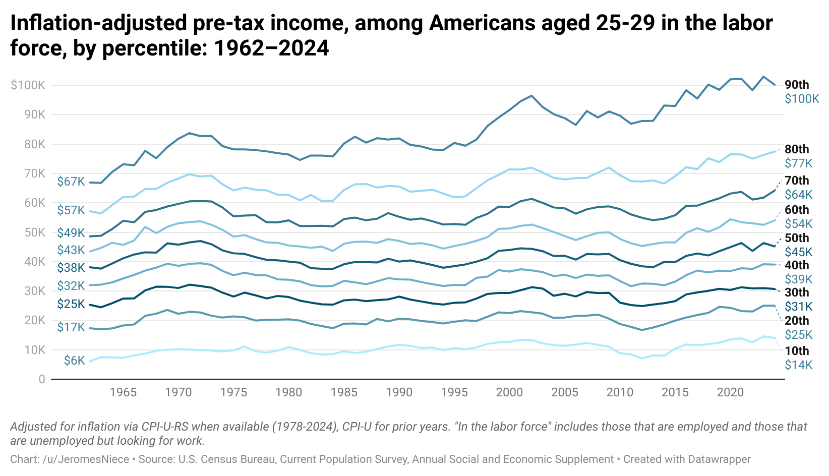
![[OC] Inflation-adjusted pre-tax income, among Americans aged 25-29 in the labor force, by percentile: 1962–2024](https://www.byteseu.com/wp-content/uploads/2025/04/p8joh4bie2we1-1536x882.png "[OC] Inflation-adjusted pre-tax income, among Americans aged 25-29 in the labor force, by percentile: 1962–2024")
[OC] Inflation-adjusted pre-tax income, among Americans aged 25-29 in the labor force, by percentile: 1962–2024
Posted by JeromesNiece
7 Comments
Income is total income as reported to interviewers, including income from wage and salary work, business income, farm income, government welfare programs, interest, dividends, rent, unemployment benefits, worker’s comp, veteran’s benefits, alimony, child support, and any other sources.
The inflation adjustment is done via the consumer price index (CPI) research series when available, which uses modern methods to adjust for price differences between years, including all major categories of consumer purchases, including housing, food, healthcare, education, transportation, consumer goods, etc.
The source is the U.S. Census Bureau’s American Community Survey, Annual Social and Economic Supplement, a government-sponsored survey including 130,000+ respondents annually, and a gold-standard in economic and social science research.
[Link to full data](https://www.datawrapper.de/_/gH594/)
I assume the dashed represents the expected trend in 2025 from Trump’s policies?
Does anyone care what their pre-tax income is? I want to know how much money I’m actually going to have to spend.
It’d be nice to see GDP-adjusted or something as well. With inflation-adjusted increases to GDP, these should all be going up significantly rather than being flat.
Most being flat implies this age group is disproportionately not benefitting from economic growth.
This is kinda stunning. Every group except for the bottom 10% increased less than 50% over the course of 60 years. Even the top 10%, who look like outliers on the chart, only increased 49%.
Then again, this is inflation adjusted. So I guess I shouldn’t be too surprised. But it’s still very jarring to see it laid out like this.
Great graph.
I would prefer completely different colors for the lines through. Shades of blue are harder to follow than choosing from other colors.
Am I crazy to think that all wages/salaries need to be indexed to inflation? I understand this would make it harder for businesses but look at this graph. This is criminal in my opinion. This graph is the reason that wealth inequality has increased to where it’s at today. Am I stupid?