
![[OC] Correlation Between US Passport Holders and College Degrees / GDP Per Capital by State](https://www.byteseu.com/wp-content/uploads/2025/05/n84vhx7hruye1-1075x1536.jpeg "[OC] Correlation Between US Passport Holders and College Degrees / GDP Per Capital by State")
Inspired by this post I thought was cool and interesting: https://www.reddit.com/r/dataisbeautiful/comments/1kevi66/oc_percentage_of_citizen_population_with_a_valid/
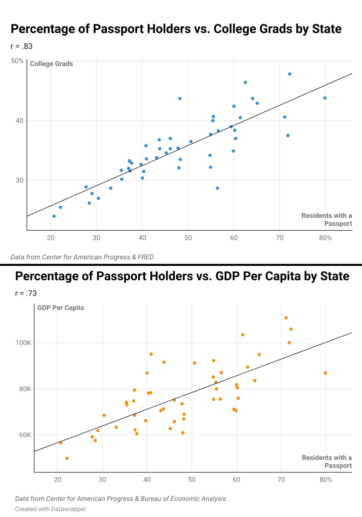
I'm sure that there are a million and one other demographic, political, economic, etc. factor that you could compare that will give you similar results, but I compared the percentage of US passport holders with the percentage of residents with college degrees which gives r = .83. I did the same for GDP per capital per state which has a slightly less strong correlation of r = .73.
Interactive versions for anyone who wants to look at particular states.
Passport Pct vs. GDP: https://www.datawrapper.de/_/mXhtj/
Passport Pct vs. College Grad Pct: https://www.datawrapper.de/_/dGGvf/
Posted by shinyro
9 Comments
Sorry, I’m not sure what the point of this is. Higher wealth or income will obviously correlate with most anything that requires money.
And here I am bucking the trend. I got a passport but no degree.
I’m curious: which states are the biggest outliers? I’m talking residuals (disparities between predicted and observed outcomes.)
I’m convinced that the best way to fix this country would be to give poor rural Americans the ability to travel. They need to learn that this country is very much not better than the rest of the world. They really seem to think all of the rest of the world including Europe lives in squalor.
Why you attacking people of Mississippi like that?
We all know it’s one of the 2 isolated left ones lol
Passport is probably the dependent variable in each graph so should be on the Y axis. GDP per Capita and College Grad are probably the independent variables, although it is Possible having a passport increases your chances of a college degree and making more money.
Now plot the states with “median salary” on the y-axis.
World travel is a luxury.
Can you make the dot colors correspond to which party won the 2024 election in that state? That would be interesting to see visually.