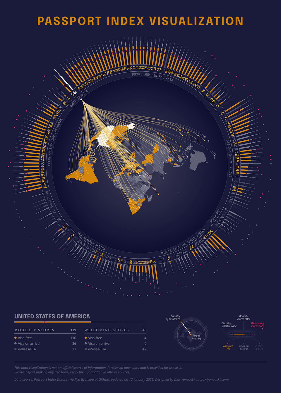
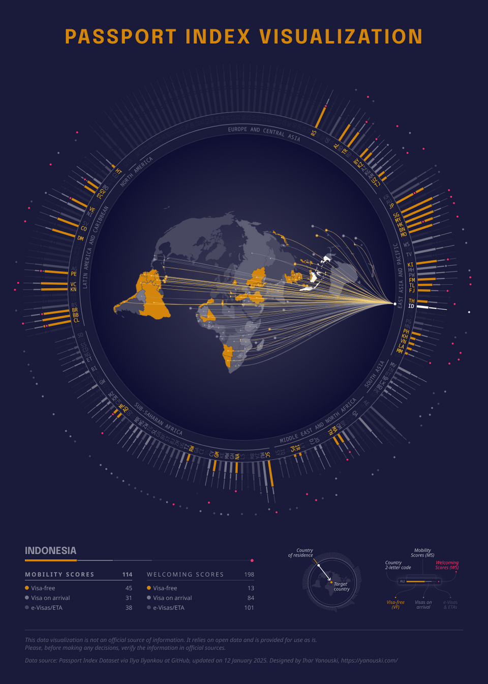
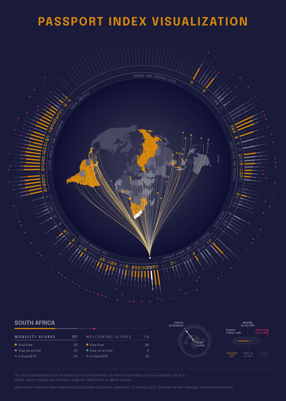
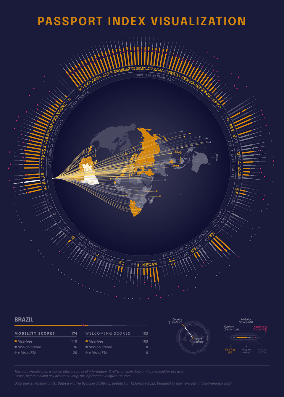
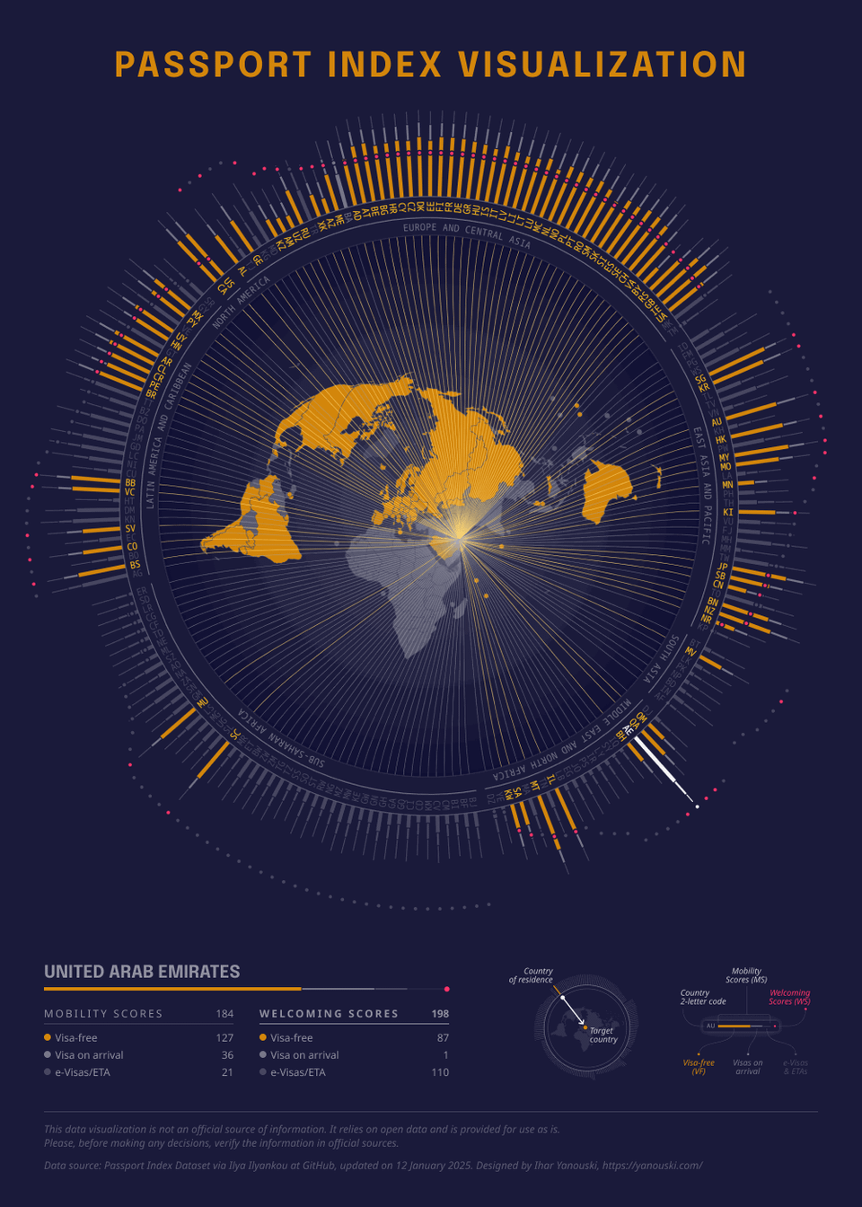
Original work
Data source: Passport Index Dataset via Ilya Ilyankou at GitHub, updated on 12 January 2025.
Posted by czaroot

![[OC] Passport Index visualization (Interactive)](https://www.byteseu.com/wp-content/uploads/2025/05/63a2ljf7vzye1-731x1024.png "[OC] Passport Index visualization (Interactive)")
Original work
Data source: Passport Index Dataset via Ilya Ilyankou at GitHub, updated on 12 January 2025.
Posted by czaroot
5 Comments
Tools: D3.js, Svelte.
Poster designed with Figma.
Wow looks great!
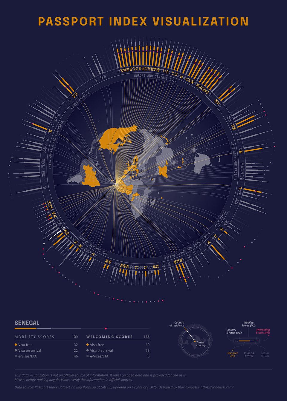
Only critique is some countries have a bit of a distorted shape. Like South Africa looks a bit pointy
Finally, actually beautiful data!
How long did it take you to be able to build visualizations like this OP? And what was your learning process?
Wow, that’s awesome! Nice work
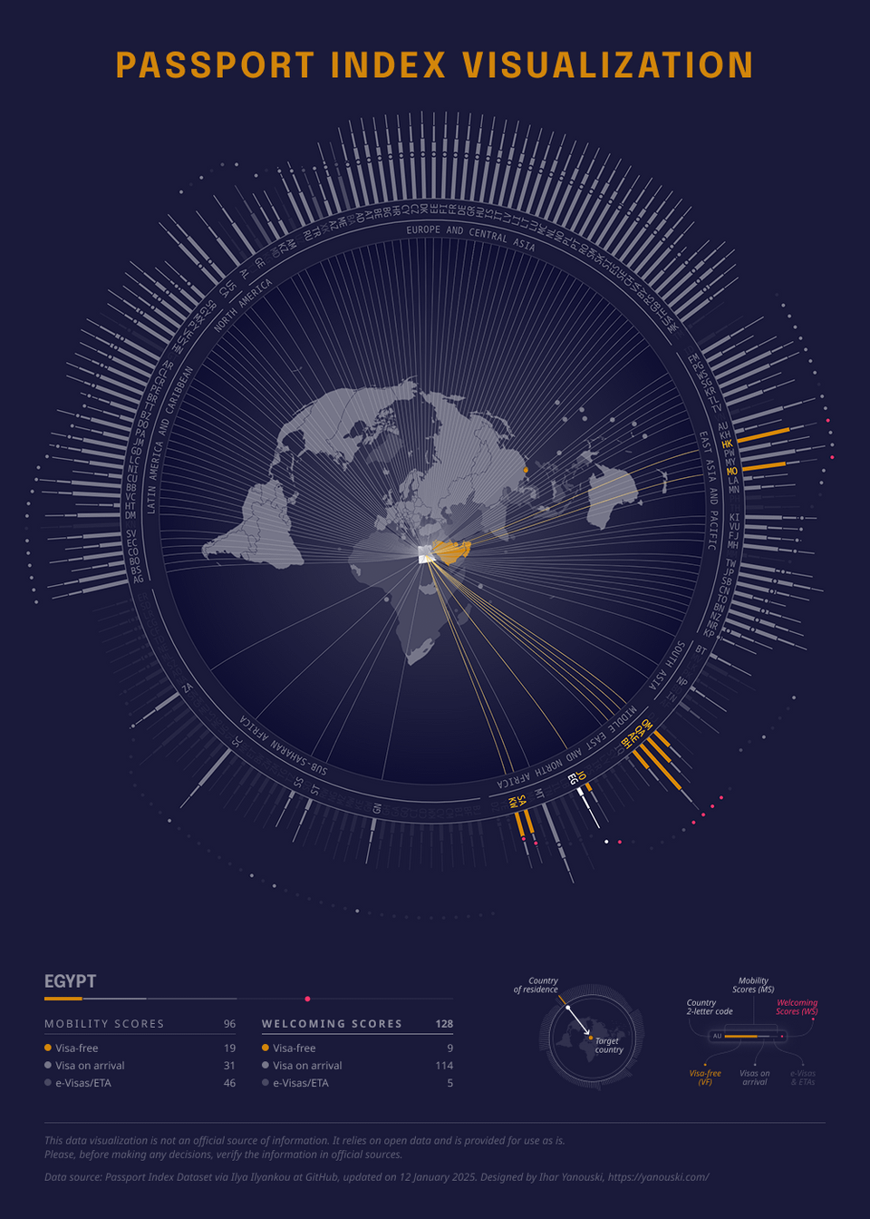
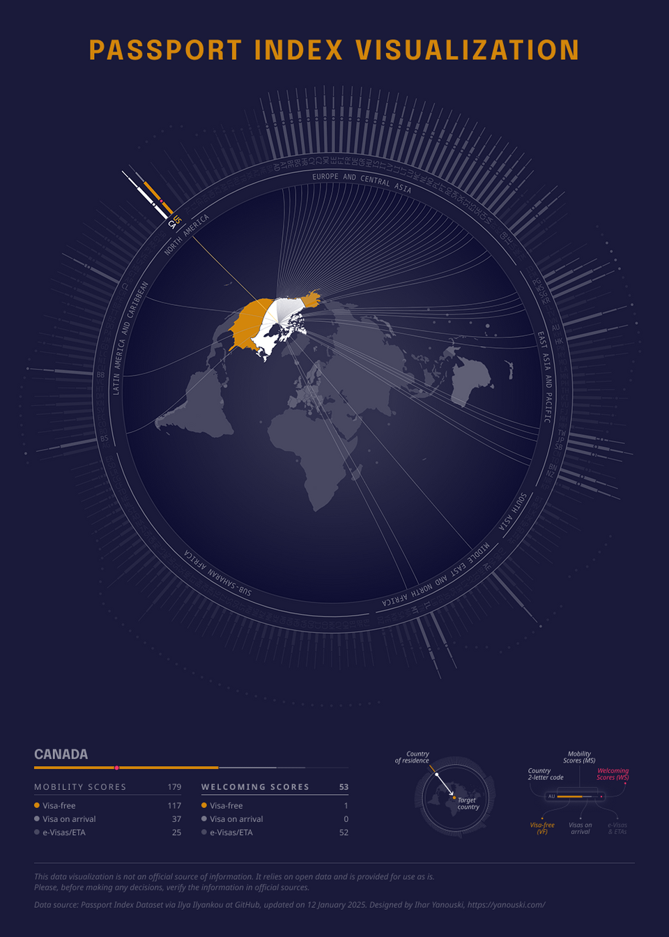
Why does Canada only have the US highlighted in orange when it has 117 visa free countries?