DATA: US Census Bureau, 2023 American Community Survey, B25035 Median Year Structure Built, https://data.census.gov/table/ACSDT5Y2023.B25035?g=010XX00US$0400000_040XX00US34
TOOL: Mapchart https://www.mapchart.net/usa.html
Posted by snakkerdudaniel

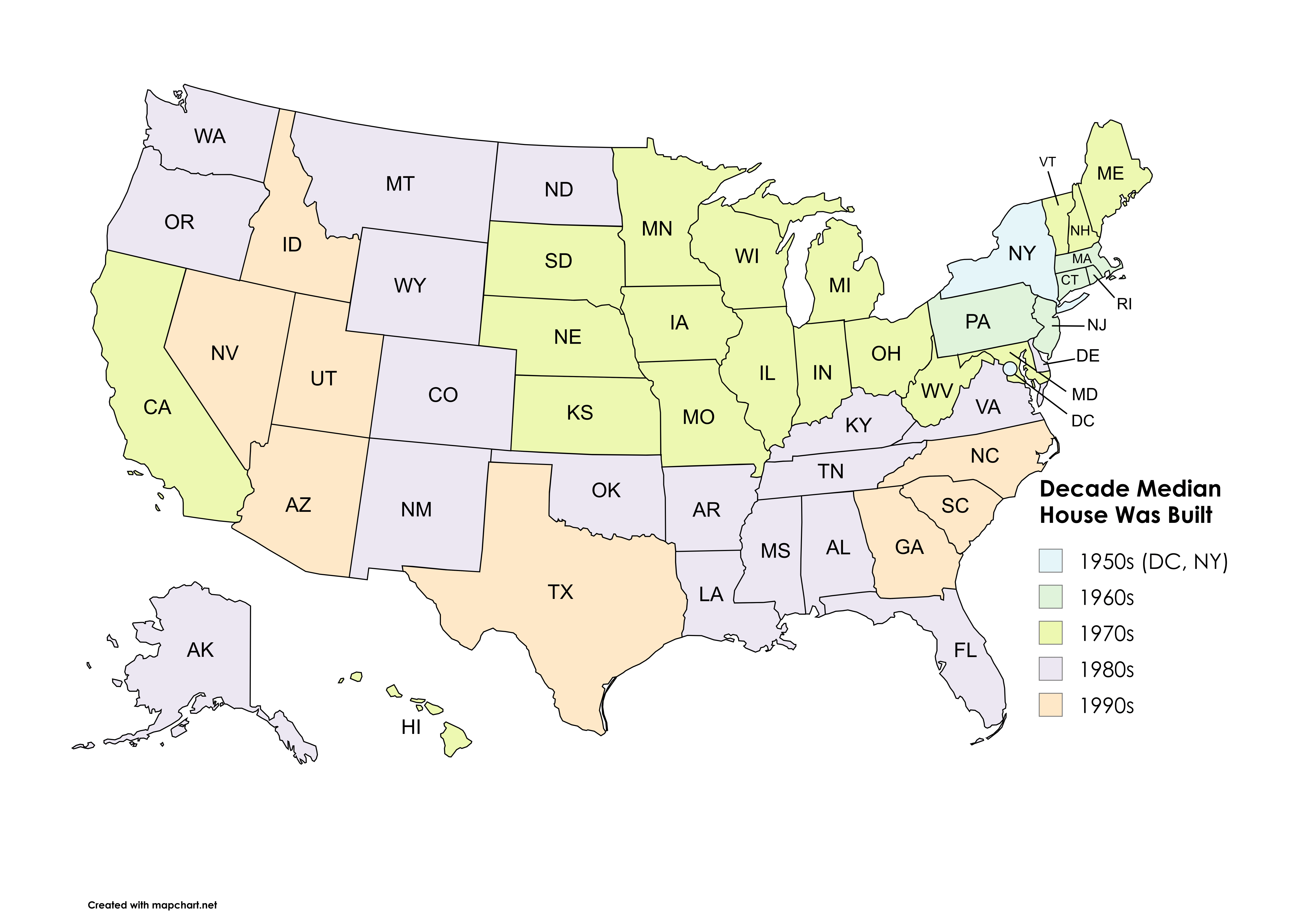
![[OC] Decade in Which the Median House Was Built by US State](https://www.byteseu.com/wp-content/uploads/2025/09/j4al2p3fbuof1-1536x1075.png "[OC] Decade in Which the Median House Was Built by US State")
DATA: US Census Bureau, 2023 American Community Survey, B25035 Median Year Structure Built, https://data.census.gov/table/ACSDT5Y2023.B25035?g=010XX00US$0400000_040XX00US34
TOOL: Mapchart https://www.mapchart.net/usa.html
Posted by snakkerdudaniel
26 Comments
DATA: US Census Bureau, 2023 American Community Survey, B25035 Median Year Structure Built, [https://data.census.gov/table/ACSDT5Y2023.B25035?g=010XX00US$0400000_040XX00US34](https://data.census.gov/table/ACSDT5Y2023.B25035?g=010XX00US$0400000_040XX00US34)
TOOL: Mapchart [https://www.mapchart.net/usa.html](https://www.mapchart.net/usa.html)
makes sense. Add Washington and Colorado and Florida to the 1990’s group and those are some of the fastest growing states in the country. They are building housing for people to be in.
Interesting data. I wish the colors were a bit more saturated so it was easier to distinguish them, though. It would also be interesting to see standard deviation.
It is very difficult to distinguish the colors in New England.
Interesting. What would be some narratives?
More/less newer housing being built? More/less older housing being torn down? Something else?
Wow, yet another “basic map with different colored states”.
I can’t tell the difference between the colors
I’m a home inspector in the RTP area of NC and last year the average year built of houses I inspected was 2012. 🤣
I feel like MA should be older and FL should be newer
Low contrast pastel colors are not a great choice
Someone should do a pie chart showing the percentage of posts in the last few days that are just maps of the USA.
😏
Will look better and be more representative of the data if done as a gradient by year. What if a state had a housing initiative in 1959? Decade skews the data from accuracy.
Color scheme is a crime. Do better.
So if you build housing more recently than 70 years ago, you get affordable housing. Who would have thought!
California is apparently that bad at building out housing.
The closer to the 1990s, the more car-centric.
WTF are these colours? 5 choices with only 2 distinct colours. Wild.
On behalf of the colour blind, do better.
Dis is kewl
Could you make these colors more washed out? I can still barely make sense of this.
This color scheme is insane.
These colors suck. Nice map otherwise
Can you pick colors that look even more similar?
I live in PA (Pittsburgh), for people that grew up in places like FL and TX, I would think they’d be shocked how old so many of the buildings are here. I moved here from Cleveland OH and it’s a difference even from there. Shit feels and looks ancient.
Useful chart with excellent sources.
Thank you.
NC, SC, and GA are interesting.
So you were trying to make it hard to visualize the data?